
Sustainability
Campaign
for CooperVision
CooperVision | Sustainability
PROJECT OVERVIEW
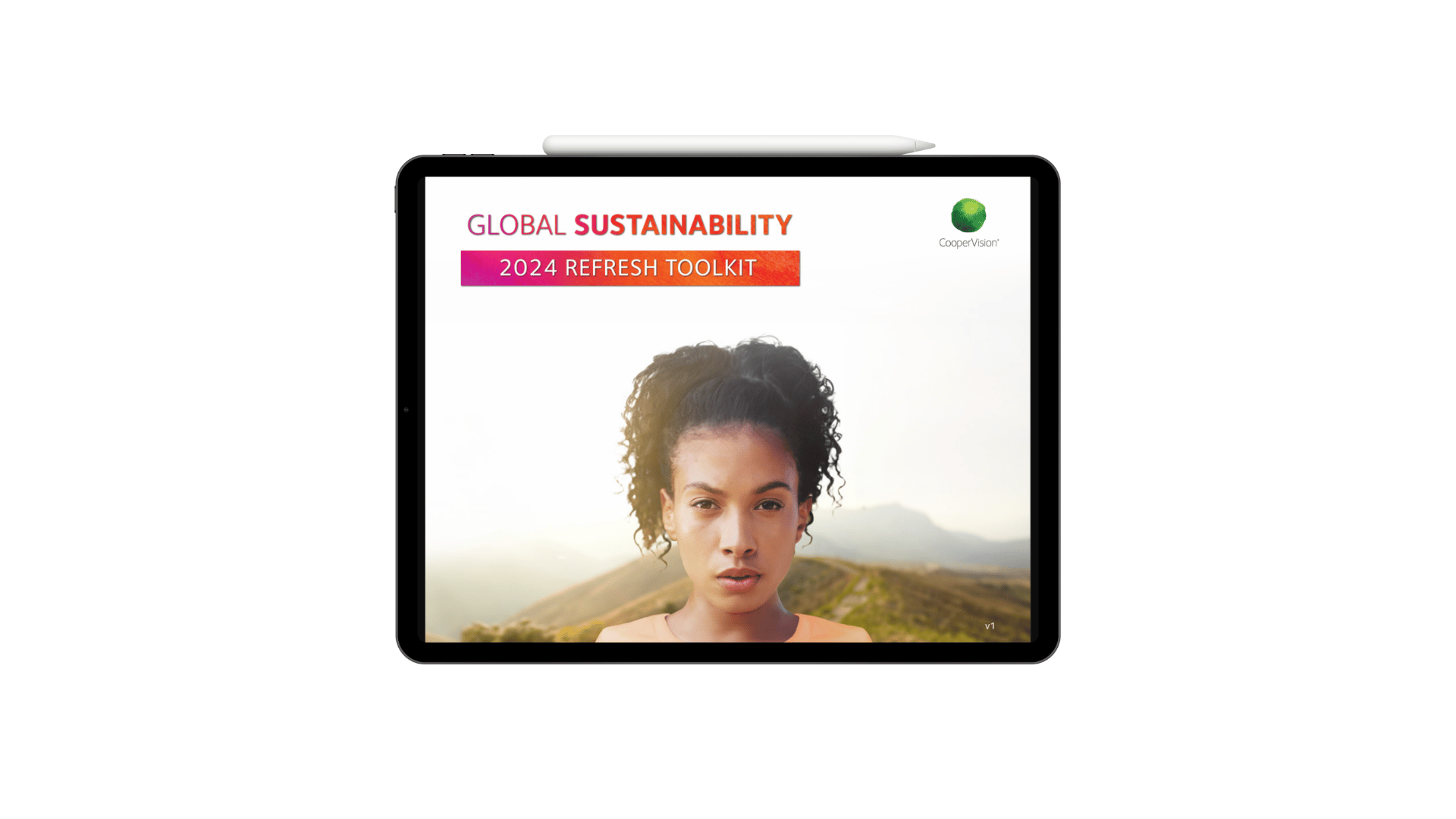
Sustainability Refresh
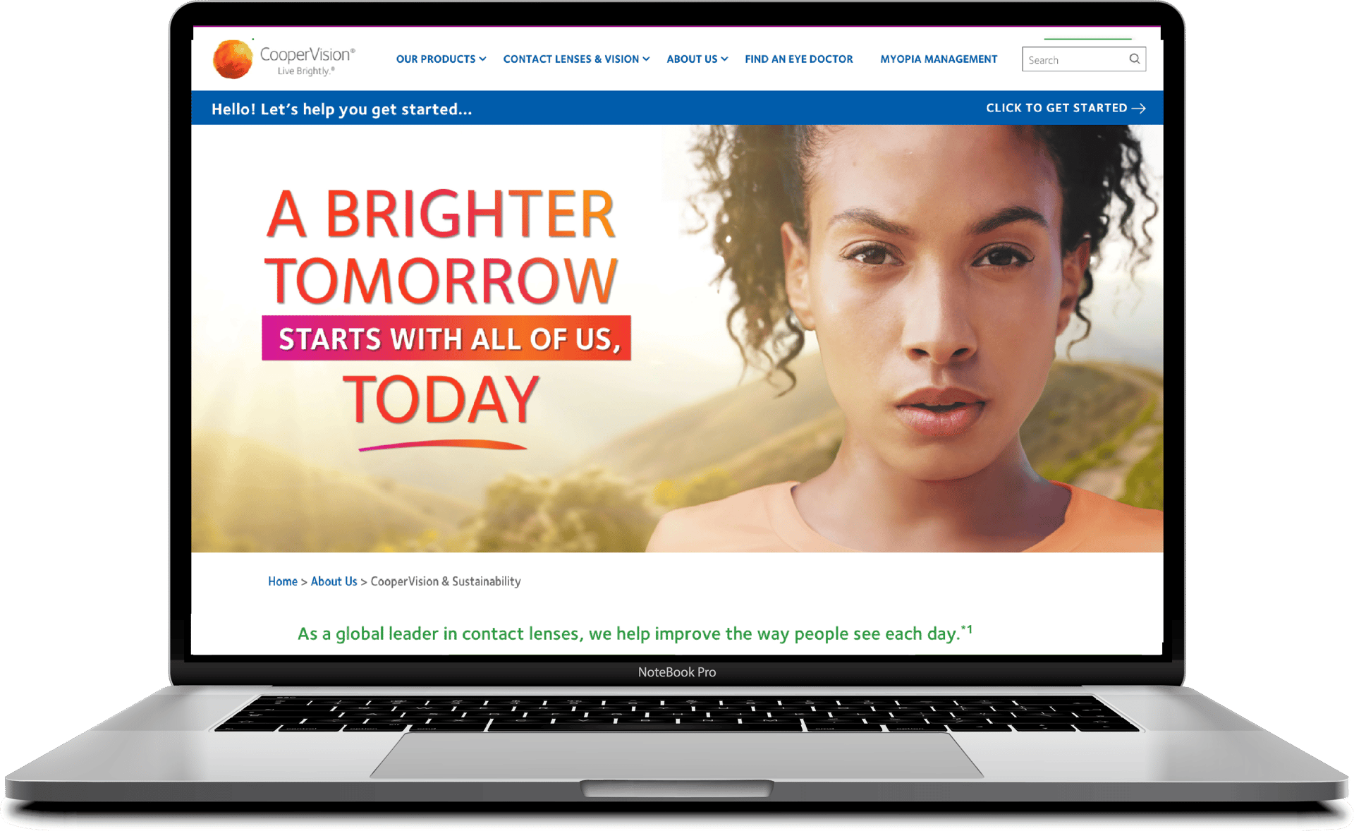
This Sustainability 2024 refresh toolkit was created to align the company’s global sustainability messaging and visuals under one cohesive, inspiring visual system.
I led the creative direction, establishing the look and feel to be used by CooperVision's teams worldwide. From hero imagery to visual guidelines, every detail was carefully crafted to reflect the commitment to the people + planet .
Marketing Campaigns | Sustainability Campaign
Client: CooperVision
Role: Lead Designer, Visual Strategy, Toolkit Creator
Collaboration: Sustainability stakeholders,
Global MarCom, Digital, PR & Agency teams
Focus: Sustainability | Global Reach
CooperVision | Sustainability
PROJECT OVERVIEW
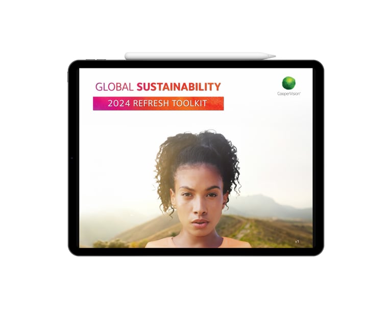
Sustainability Refresh
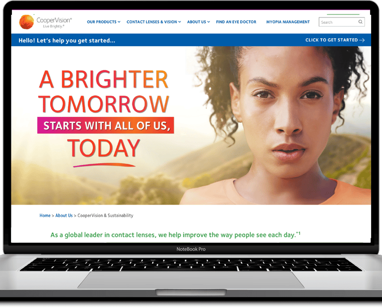
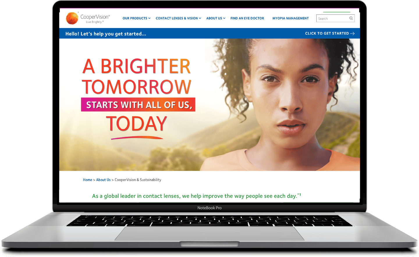
The Sustainability 2024 Refresh Toolkit was developed to unify CooperVision’s global sustainability messaging under one cohesive and inspiring visual system.
I led the creative direction, establishing the look and feel to be used by CooperVision's teams worldwide. From hero imagery to visual guidelines, every detail was carefully crafted to reflect the commitment to the people + planet .
Marketing Campaigns | Sustainability Campaign
Client & Focus:
CooperVision
Sustainability
Global Reach
Role:
Lead Designer
Visual Strategy
Toolkit Creator
Collaboration:
Global MarCom,
Sustainability stakeholders, Digital, PR team & Agency
The Challenge
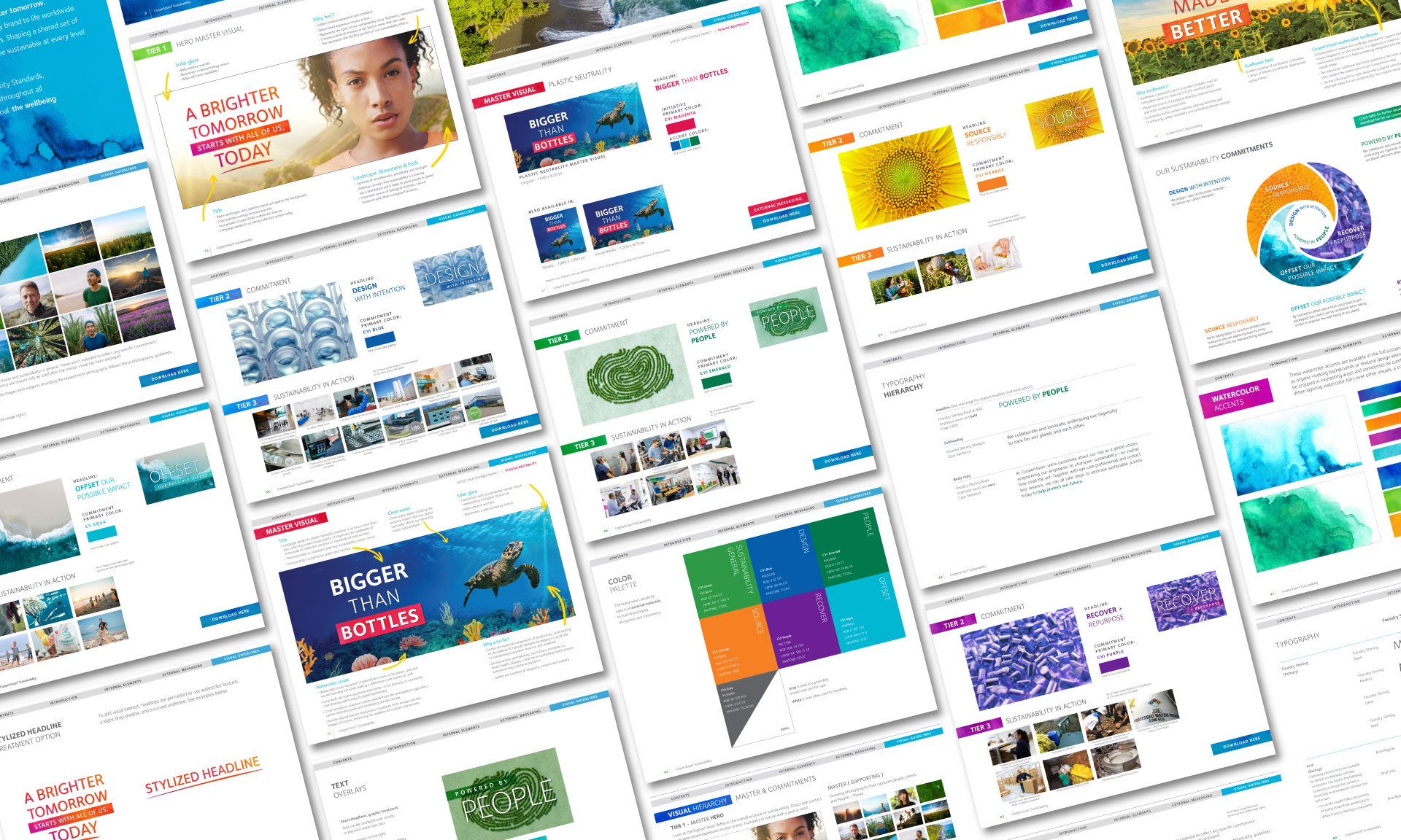
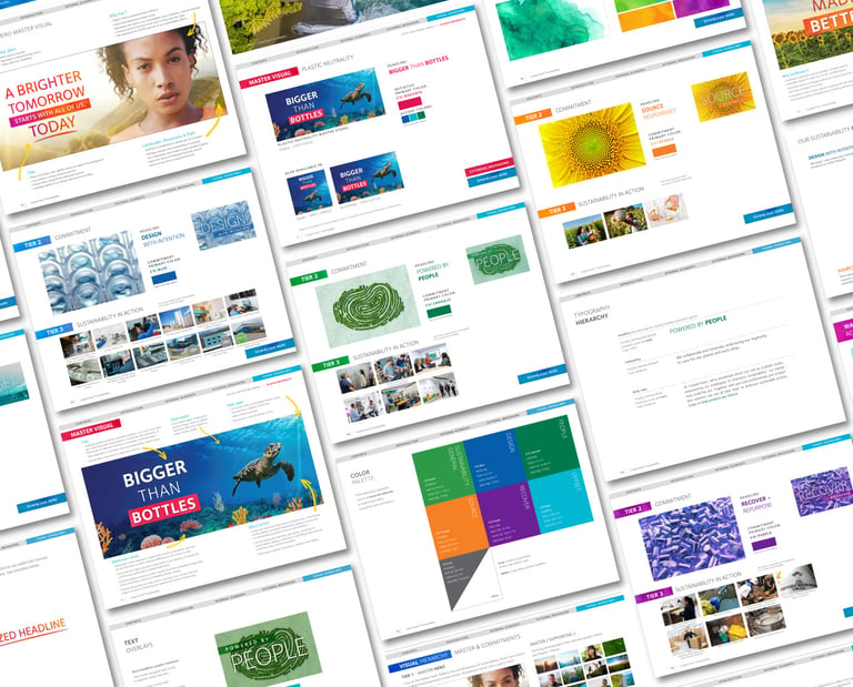
The main challenge was translating a complex, global sustainability strategy into a cohesive, visually engaging system that could be adopted globally. This required creating a unifying visual language — including a regenerative framework, master hero image, initiative-specific visuals, and a full design toolkit — while aligning with multiple stakeholders to ensure cultural relevance and brand consistency. From imagery to typography, tone, claims, and global messaging, every piece had to work together seamlessly to reflect the company’s sustainability commitments in a meaningful, actionable way.
Creative Approach
I developed a visual system that translated complex sustainability goals into meaningful, story-driven design, such as:
Regenerative framework with the company's commitments on sustainability, with People + Planet at heart.
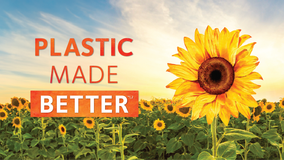
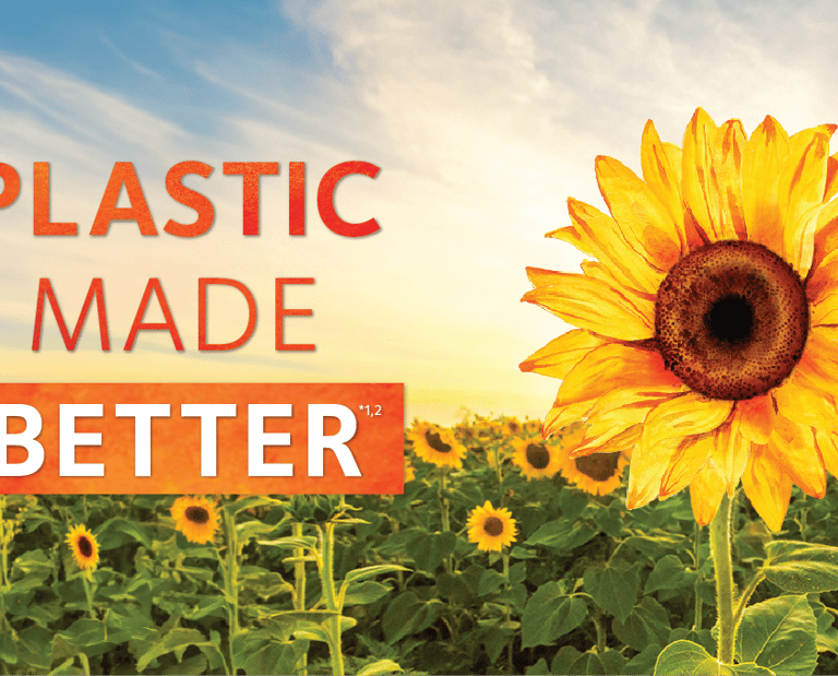
Plastic Neutrality and Sunflower initiative hero images aligning with master brand
Approved photography selection & color standards
Typography guidelines, stylized headline treatments, and text overlays
Watercolor accents to connect back to the master brand
Web graphics, icons, and tier-specific visuals
The creative system was intentionally designed to be flexible and adaptable across global regions while upholding a strong, unified visual narrative that reinforces brand consistency.
Hero master visual creation with strong rationale behind every element (translated into multiple languages).
Typography & title treatments
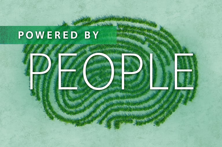
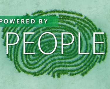
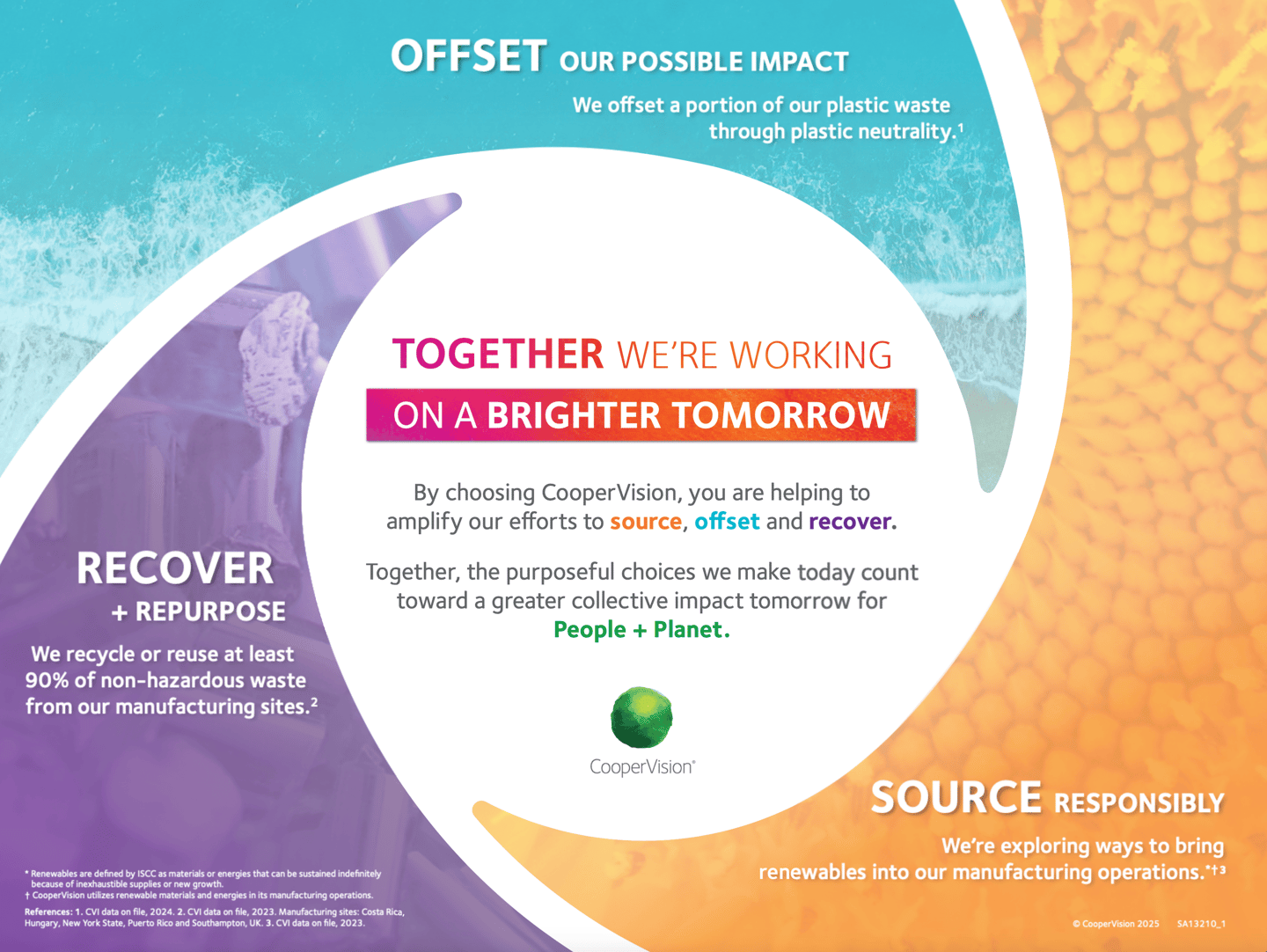
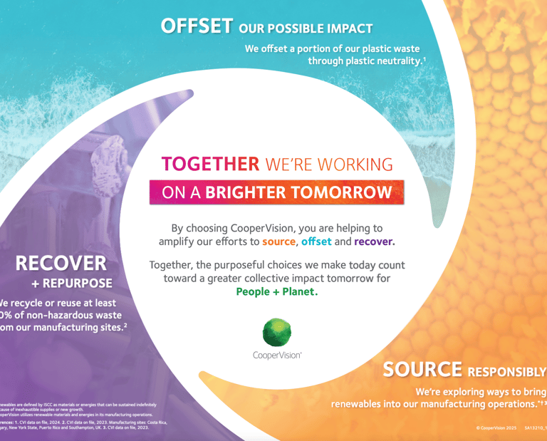
The visual system for the sustainability commitments is rooted in five pillars with a meaningful abstract approach:
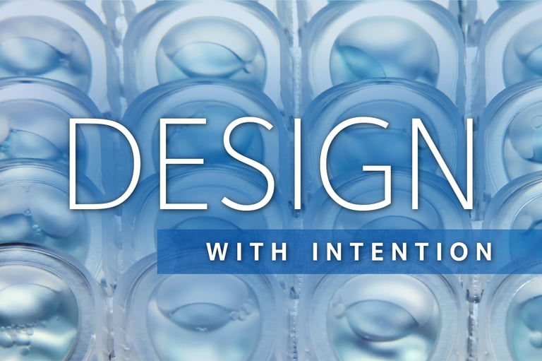
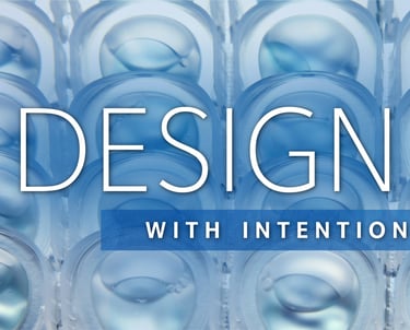
Design with Intention – represented with contact lens blisters
Powered by People – portrayed with a thumb print created by trees
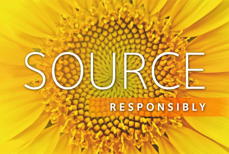
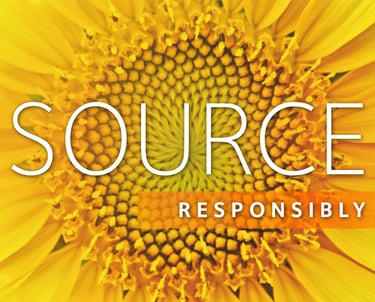
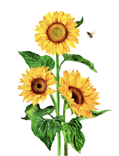
Source Responsibly – represented by a sunflower
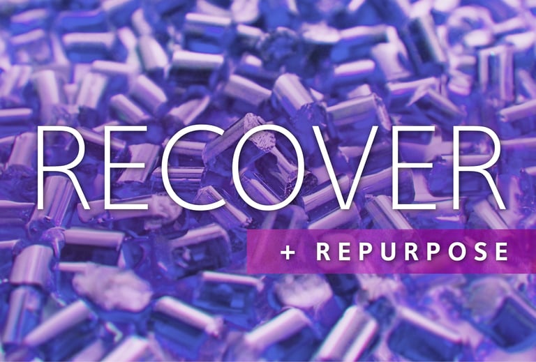
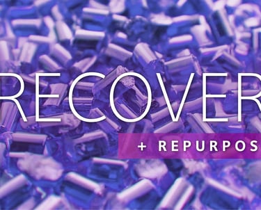
Recover + Repurpose – shown through recycled plastic pellets
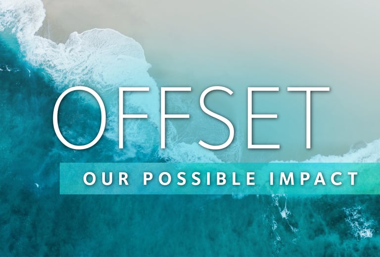
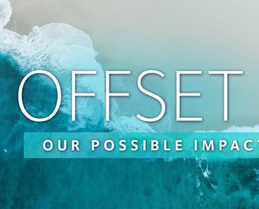
Offset our Possible Impact – visualized by the ocean
The Commitment Wheel
Developing the regenerative framework required strategic alignment to ensure each commitment was clearly communicated and visually supported.

Design Lead &
Creative Contributions
I led the creative direction for CooperVision’s global Sustainability 2024 refresh, shaping a cohesive visual system that aligned with both brand and sustainability goals. This included developing the master hero image, initiative-specific visuals (such as the Sunflower for “Source Responsibly”), and building out a flexible regenerative framework. I created supporting visual assets, defined primary and accent color systems, and designed a comprehensive toolkit with clear guidelines for global teams — covering typography, messaging, claims, web copy, and tone.
Oversaw alignment of visual and messaging elements across regions and creatively directed external agencies producing videos, web content, and more. Achieved 87% global adoption (with remaining markets pending translation and approval).
Results
GLOBAL ADOPTION
Toolkit adopted ≈90% company-wide
Increased clarity and visual consistency in sustainability messaging
Cross-functional collaboration between Sustainability, MarCom, PR, Digital, Regional teams & agency
CONSISTENCY
COLLABORATION
The toolkit is now used globally by internal and external-facing teams. It has improved consistency in sustainability messaging, made complex data more visually digestible, and served as a flexible system adopted across platforms.
Visual System by Initiatives
The initiatives are how the sustainability commitments are actioned.
This section showcases the key visual elements created for each sustainability initiative — including hero images, primary and accent colors, and supporting graphics. For example, “Reducing Carbon Emissions” falls under the Source Responsibly pillar, represented by a sunflower — a symbol of regeneration and thoughtful sourcing.
Each visual was designed to seamlessly connect back to the overarching master hero image, ensuring consistency, cohesion, and a unified global narrative.
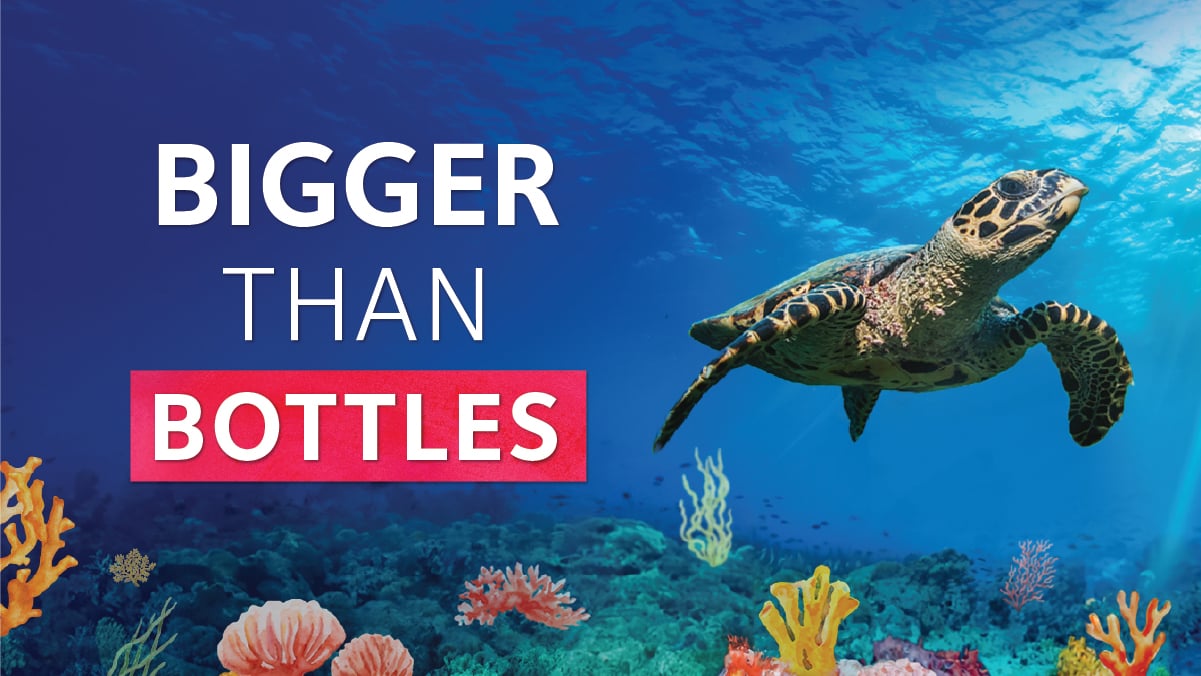
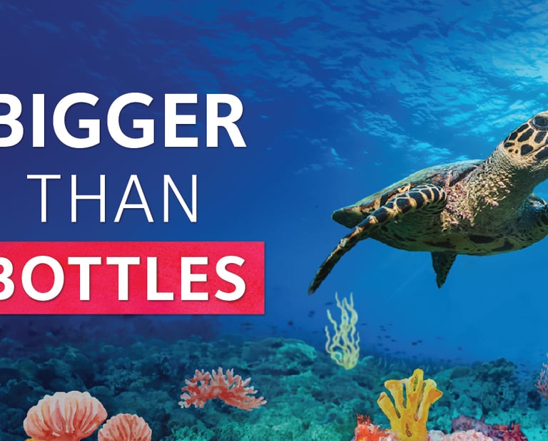
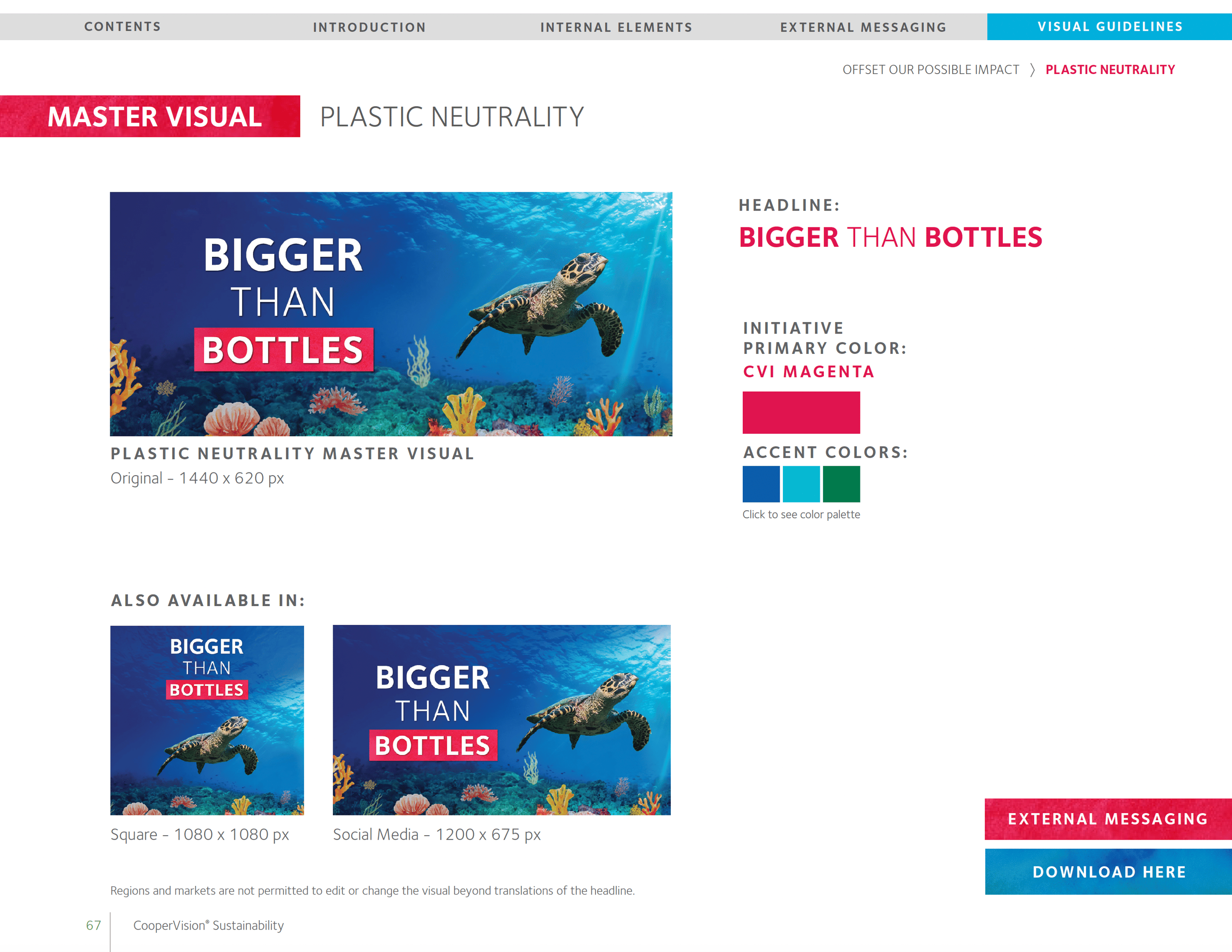
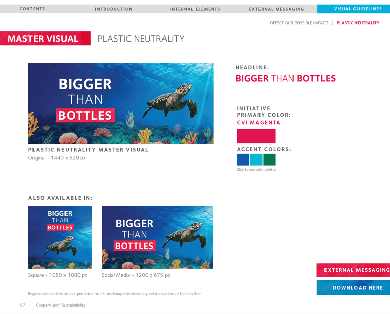
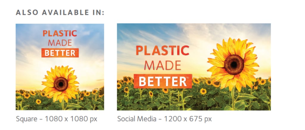
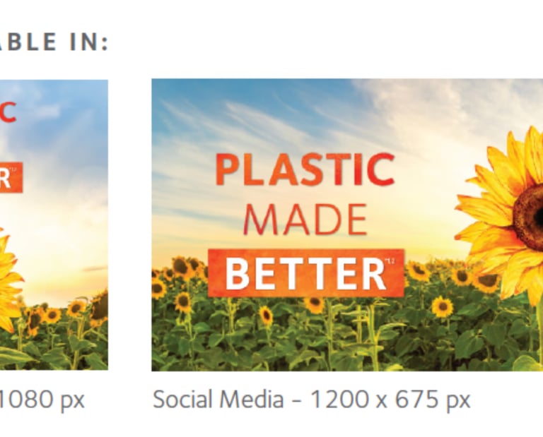
PLASTIC NEUTRALITY

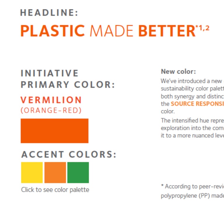
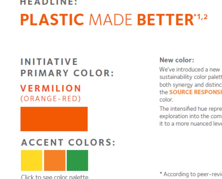


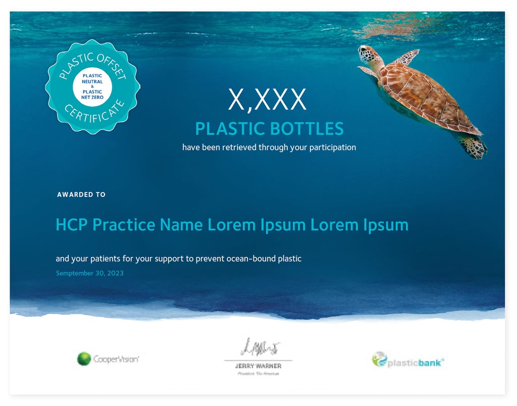
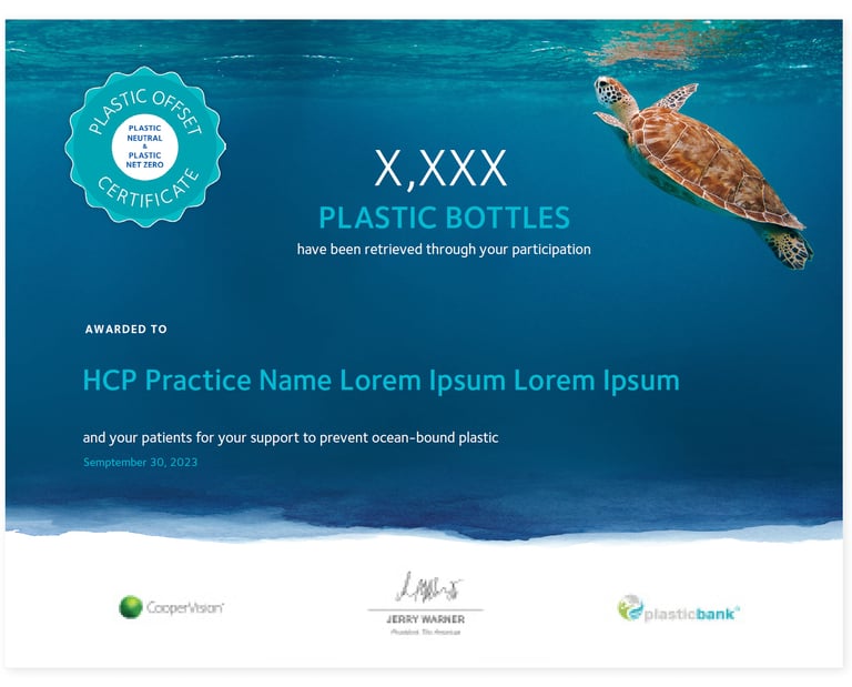
A plastic neutrality certificate template was created to recognize the impact an individual doctors office, or an aggregate of accounts has towards their plastic neutrality efforts.
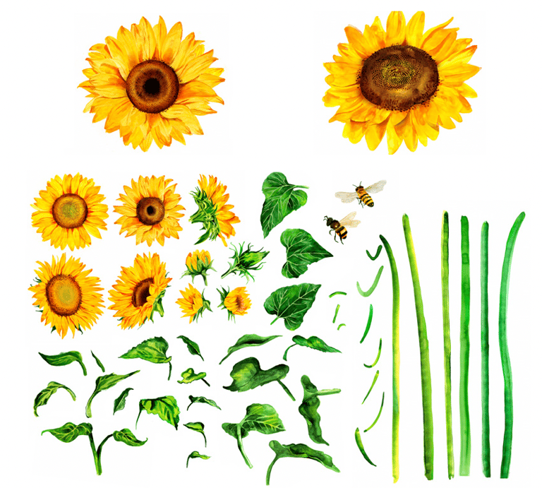
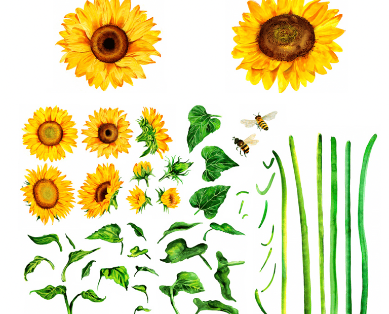
Sunflower compositions
A library of deconstructed sunflower elements including sunflower heads, different blooming stages, leafs, stems and bees, are available for users to construct in endless configurations. Sunflowers were hand-painted by the artist who created the CooperVision logo watermark.
SOURCE RESPONSIBLY
Global Sustainability Toolkit
The Sustainability 2024 Toolkit was designed to bring consistency and clarity to how CooperVision communicates its sustainability story across regions. It includes visual guidelines, usage examples, tone of voice, web copy, claims, and messaging — all built around the refreshed creative direction.
From master hero imagery to initiative-specific assets, the toolkit equips global teams with everything they need to confidently apply the new visual system while staying aligned with the brand’s sustainability commitments.
This was a passion project for me—one that merged my visual storytelling skills with my personal values around sustainability and planet care. I’m proud of how each element tells a story and how the toolkit empowers teams to communicate sustainability with purpose and impact.
Design with Purpose.
SELSA Studio
Creative Design & Marketing
By Elsa Oroz
Get in touch
Connect
SELSAstudio@gmail.com
© 2025. All rights reserved.