Trade Shows &
Large-Scale Graphics
Bringing Brand Presence to Life
Conference Graphics
At SELSA Studio, we transform spaces into brand experiences. From global trade shows to office environments, our large-scale designs blend creativity with strategic intent—helping companies stand out while staying true to their identity. Whether developing complete trade show themes, environmental graphics, or impactful banners and window displays, each project is crafted with precision, brand alignment, and visual storytelling that captivates audiences and builds recognition.

Environmental Design
Banners & Posters

Conference Booth Graphics
Large-scale booth and event visuals designed to anchor brand presence at major industry conferences. Each concept blends thematic storytelling with product focus to create cohesive, memorable experiences.
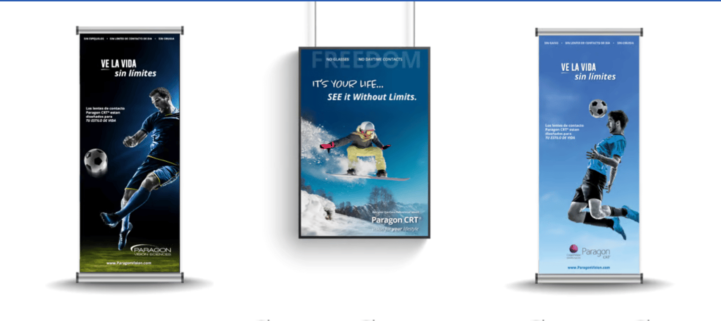
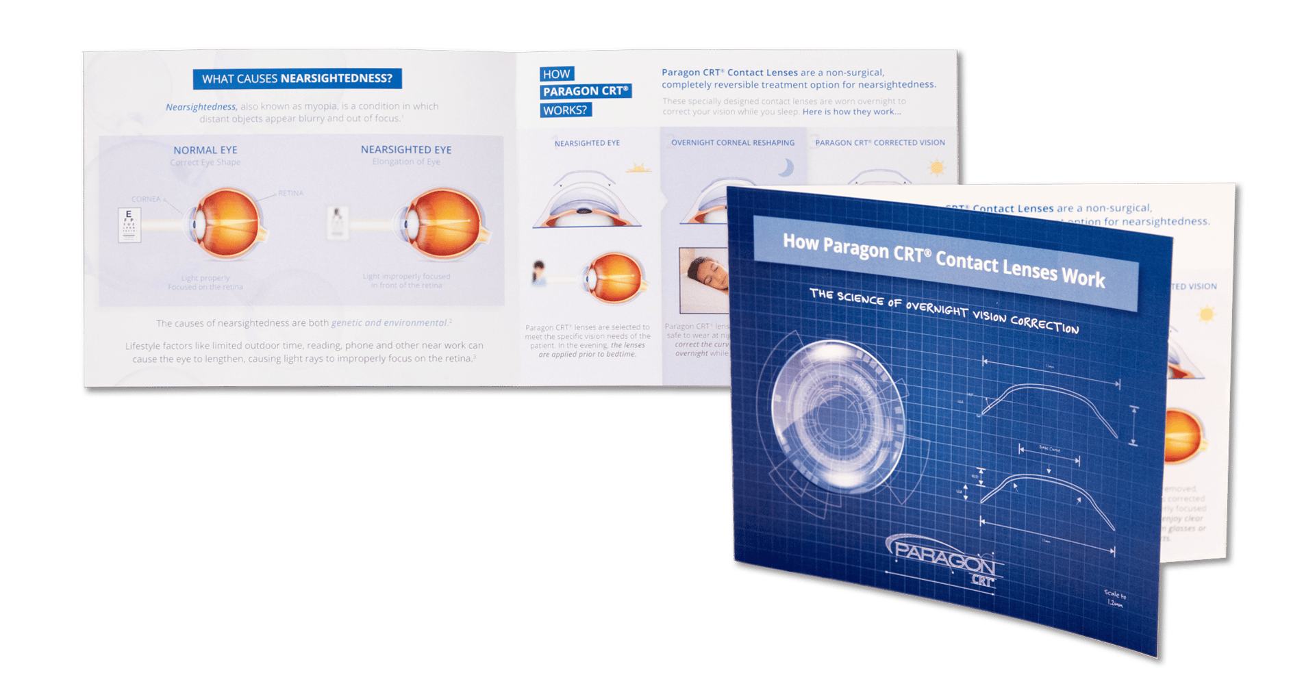
Paragon CRT®
Trade Shows & Large-Scale Graphics | Conference Booth Graphics
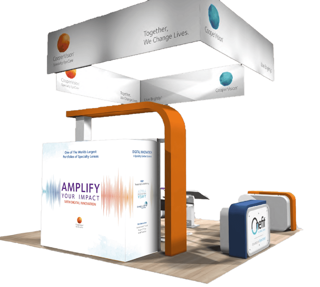
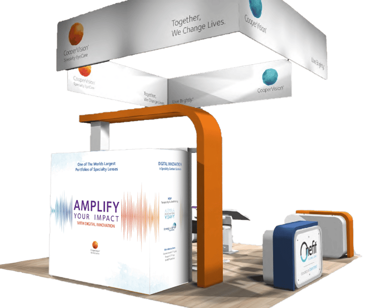
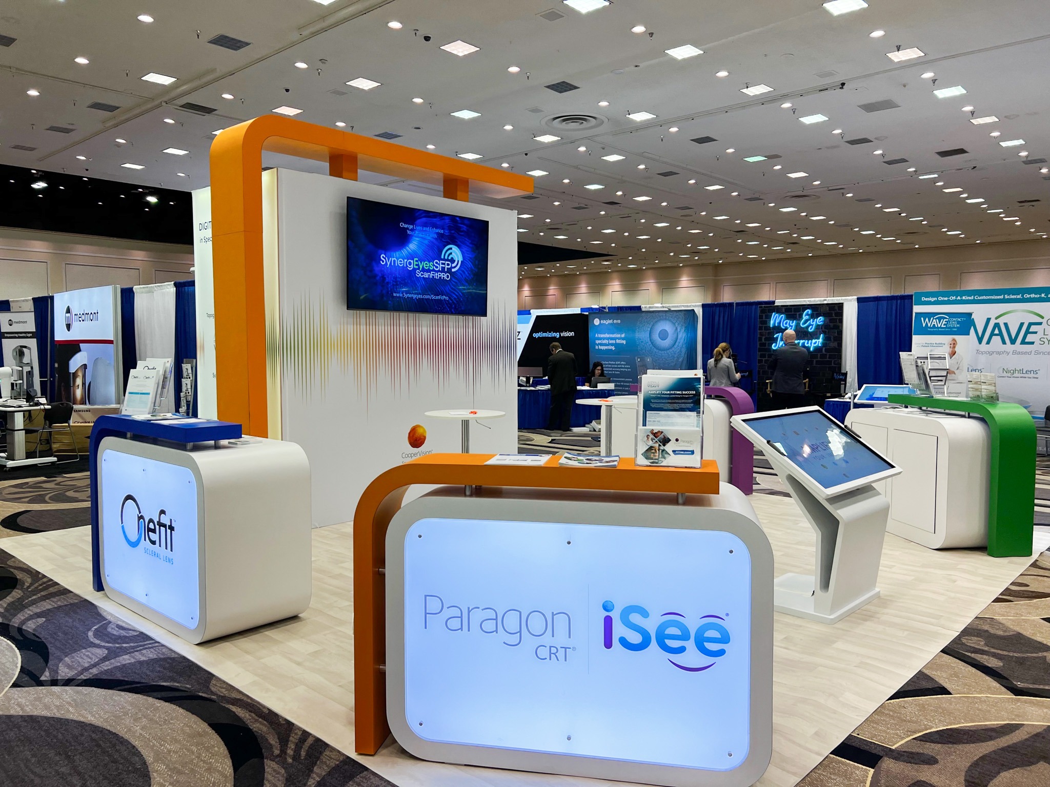
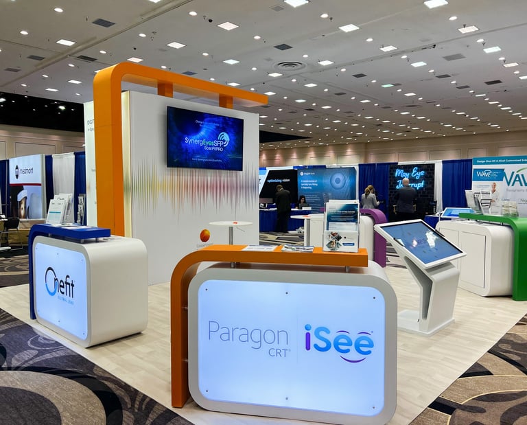
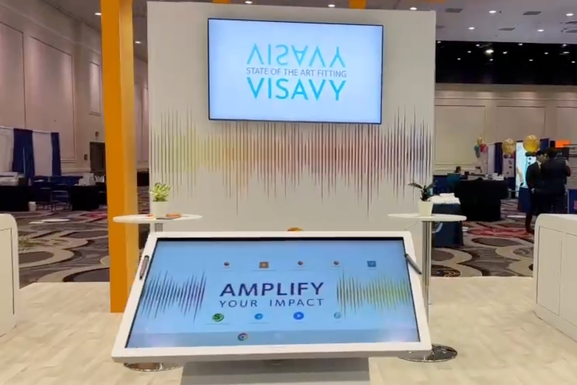
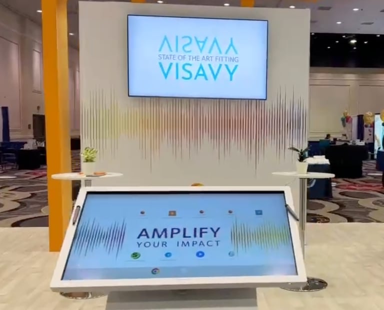
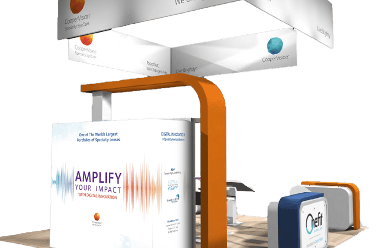
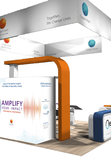
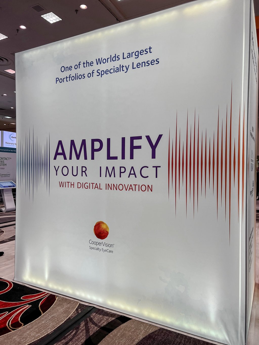
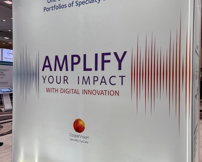
AMPLIFY Booth
CHALLENGE
The client sought to elevate its conference experience with a unifying, memorable theme that could connect multiple global events.
Past booths had distinct visuals for each show, but lacked a cohesive identity that extended across the year’s marketing efforts.
Client: CooperVision Specialty EyeCare
Role: Concept Development, Graphic Design, Environmental Graphics
Collaboration: Global Events & Marketing Teams
Focus: Trade show designs, Brand Experience
APPROACH
Developed the “AMPLIFY YOUR IMPACT” theme to serve as the visual and conceptual foundation for the brand’s event presence throughout the year. Designed a vibrant, dynamic booth that reflected the idea of amplification—using bold color gradients, large-scale typography, and interactive elements to engage visitors. The adaptable design system allowed the theme to evolve seamlessly across various events and marketing materials.
Paragon CRT®
Trade Shows & Large-Scale Graphics | Trade Show Booth Graphic Design
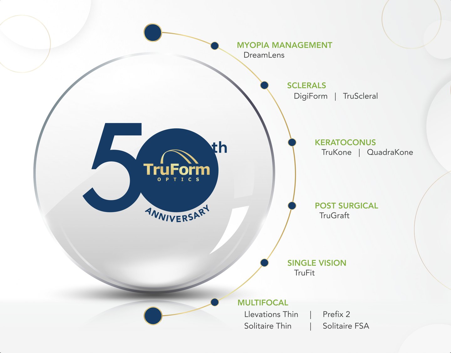
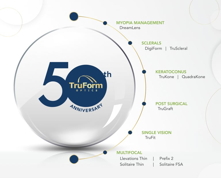
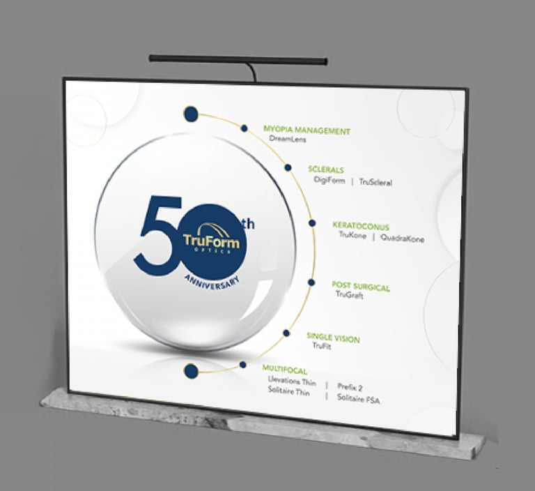
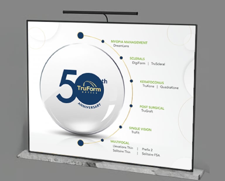
TruForm 50th Anniversary Backdrop
OVERVIEW
To celebrate TruForm Optics’ 50th anniversary, I led the creative evolution of their brand presence with a refined visual identity and a new commemorative logo. The goal was to honor five decades of innovation while modernizing their image to align with CooperVision’s premium aesthetic.
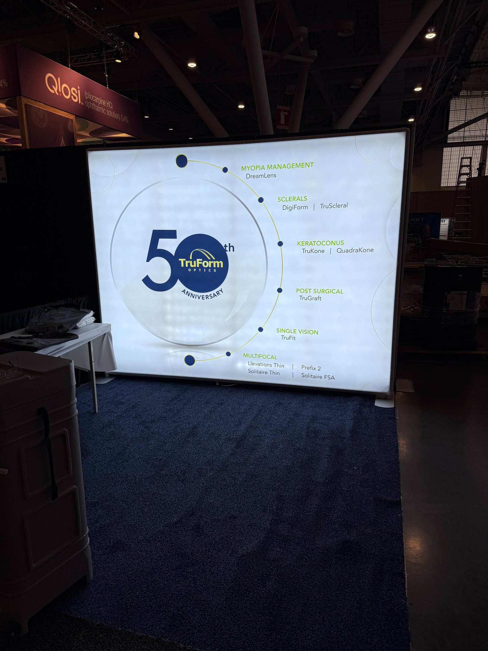
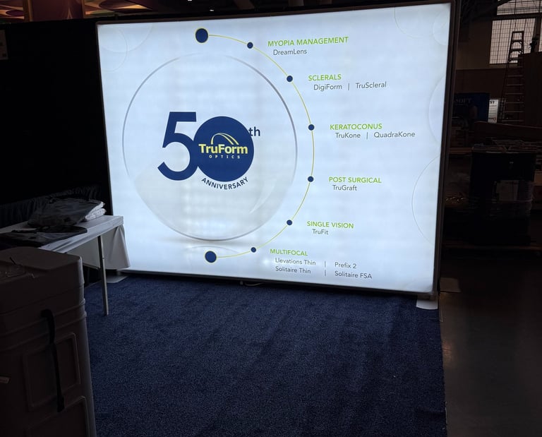
Client: TruForm Optics
Role: Design, Creative Direction
Collaboration: Global Marketing Team & TruForm General Management
Focus: Trade Show Graphics, Brand Evolution
APPROACH
The booth backdrop design combined elegance and heritage—balancing metallic tones, sophisticated typography, and clean brand lines to create a polished, upscale look. This refreshed design not only marked a milestone but also elevated TruForm’s visibility at the event. The updated branding received widespread positive feedback, with the General Manager noting numerous compliments from attendees on the booth’s striking new look.
Paragon CRT®
Trade Shows & Large-Scale Graphics | Trade Show Booth Graphic Design
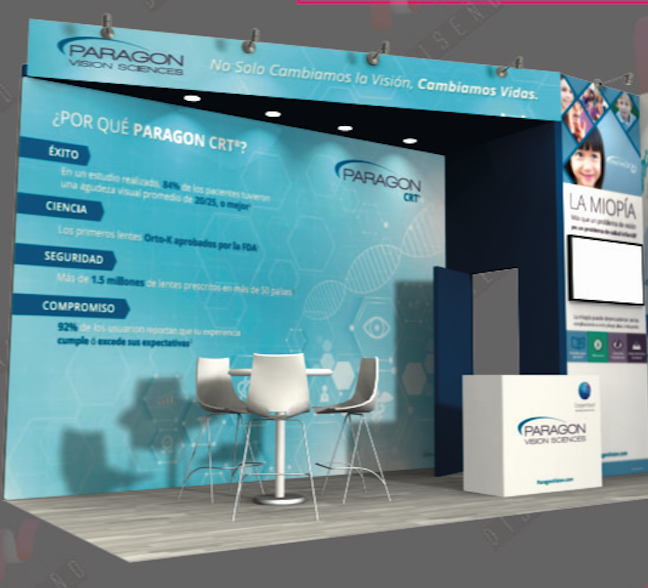

Paragon Vision Sciences LATAM Conference Booth Design
OVERVIEW
Created a conference booth for Paragon Vision Sciences focused on the theme “Why Choose Paragon?” The design combined a modern, medical aesthetic with clear educational messaging to highlight the science and trust behind Paragon CRT® lenses. Clean visuals, brand colors, and precise structure emphasized clinical credibility while maintaining approachability. Presented both as a render and live installation, the booth successfully engaged attendees and reinforced brand confidence within the Latin American market.

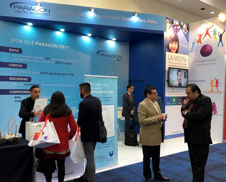
Client: Paragon Vision Sciences
Role: Design, Visual Direction
Collaboration: Regional Marketing, Marketing Teams
Focus: Trade show designs, Brand Messaging
Paragon CRT®
Trade Shows & Large-Scale Graphics | Trade Show Booth Graphic Design
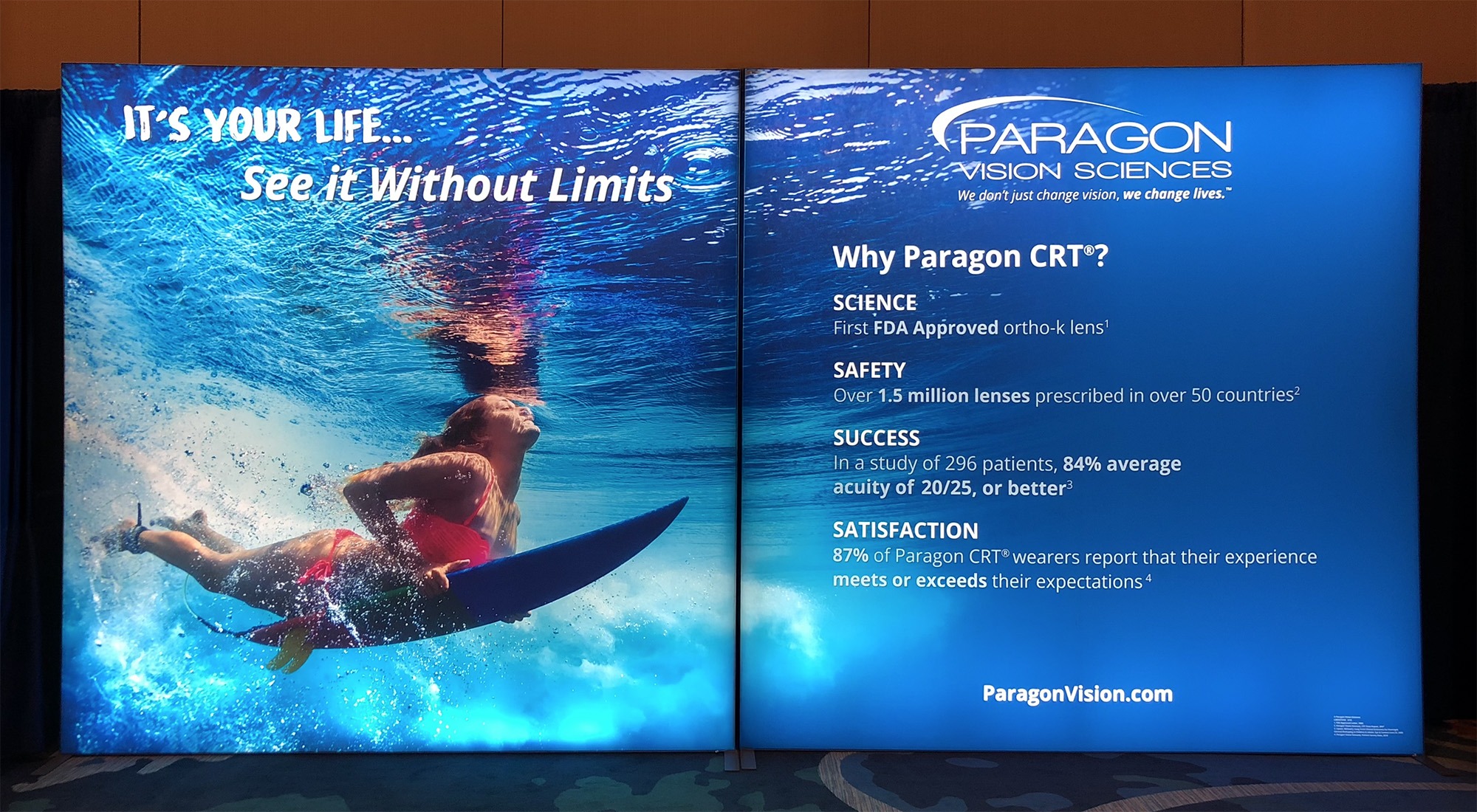
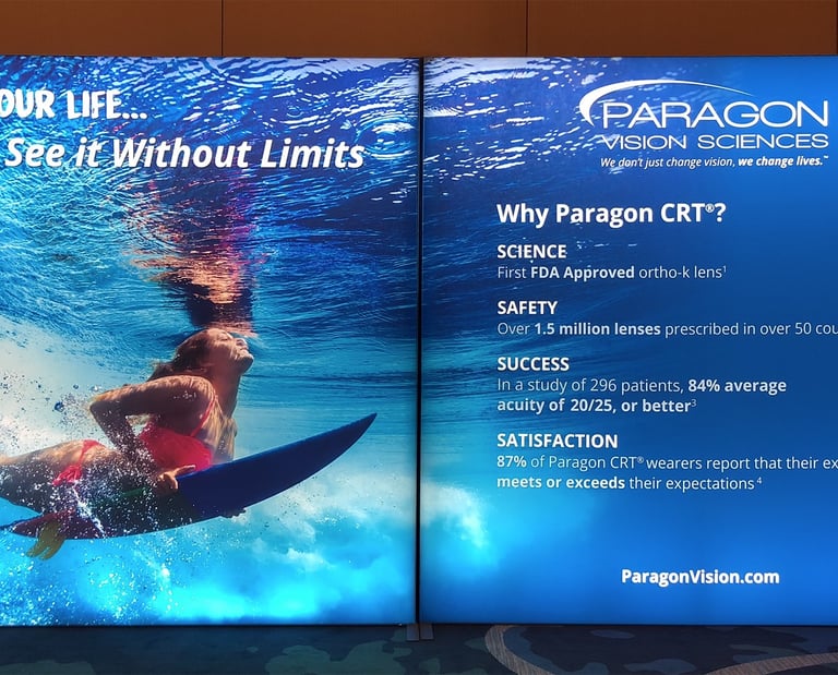
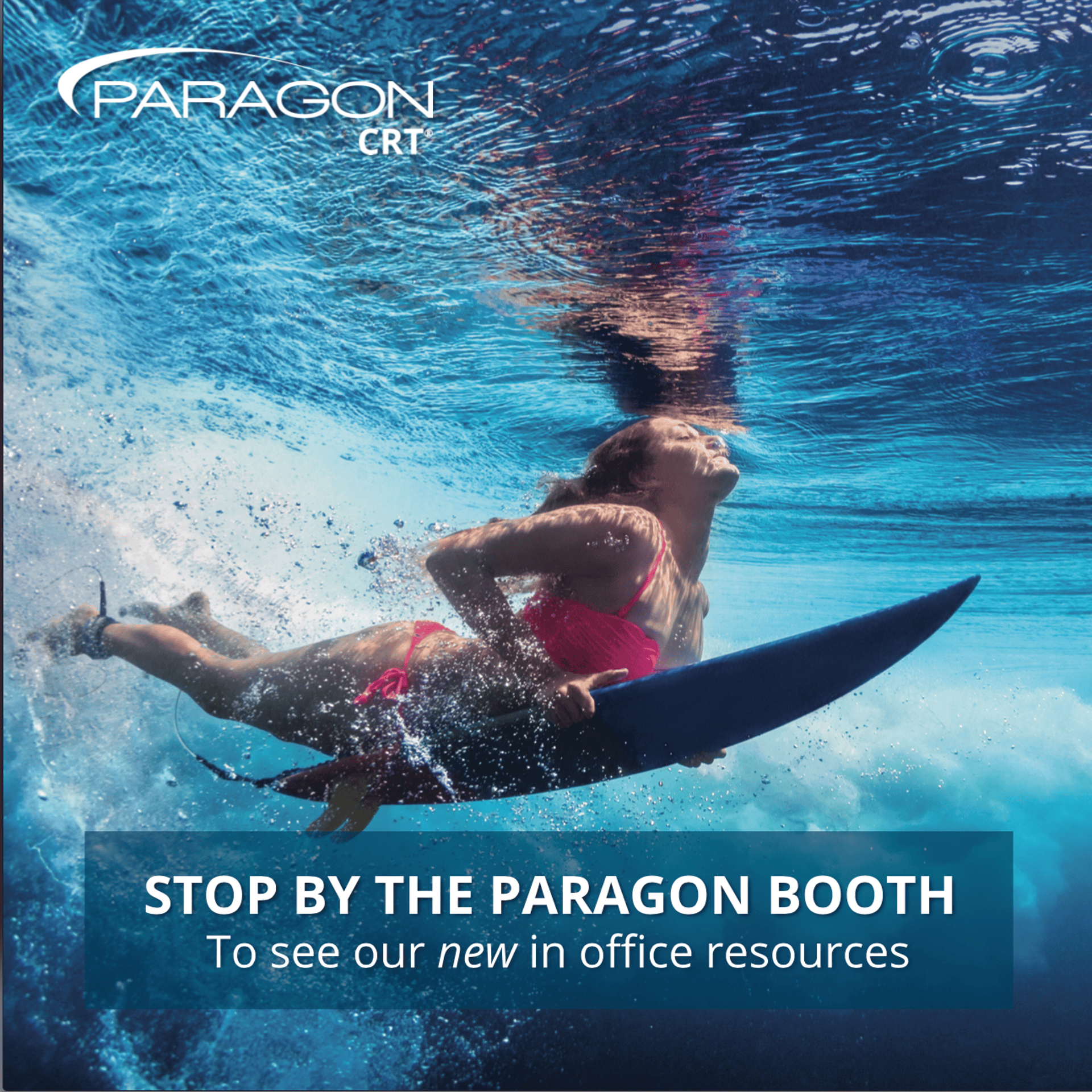
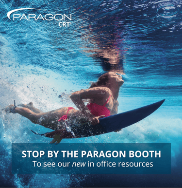
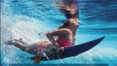
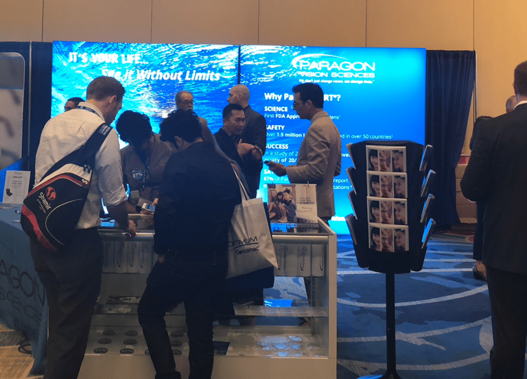
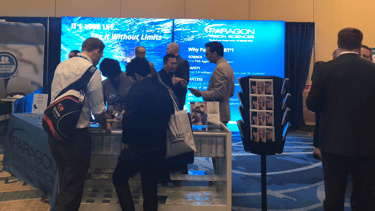
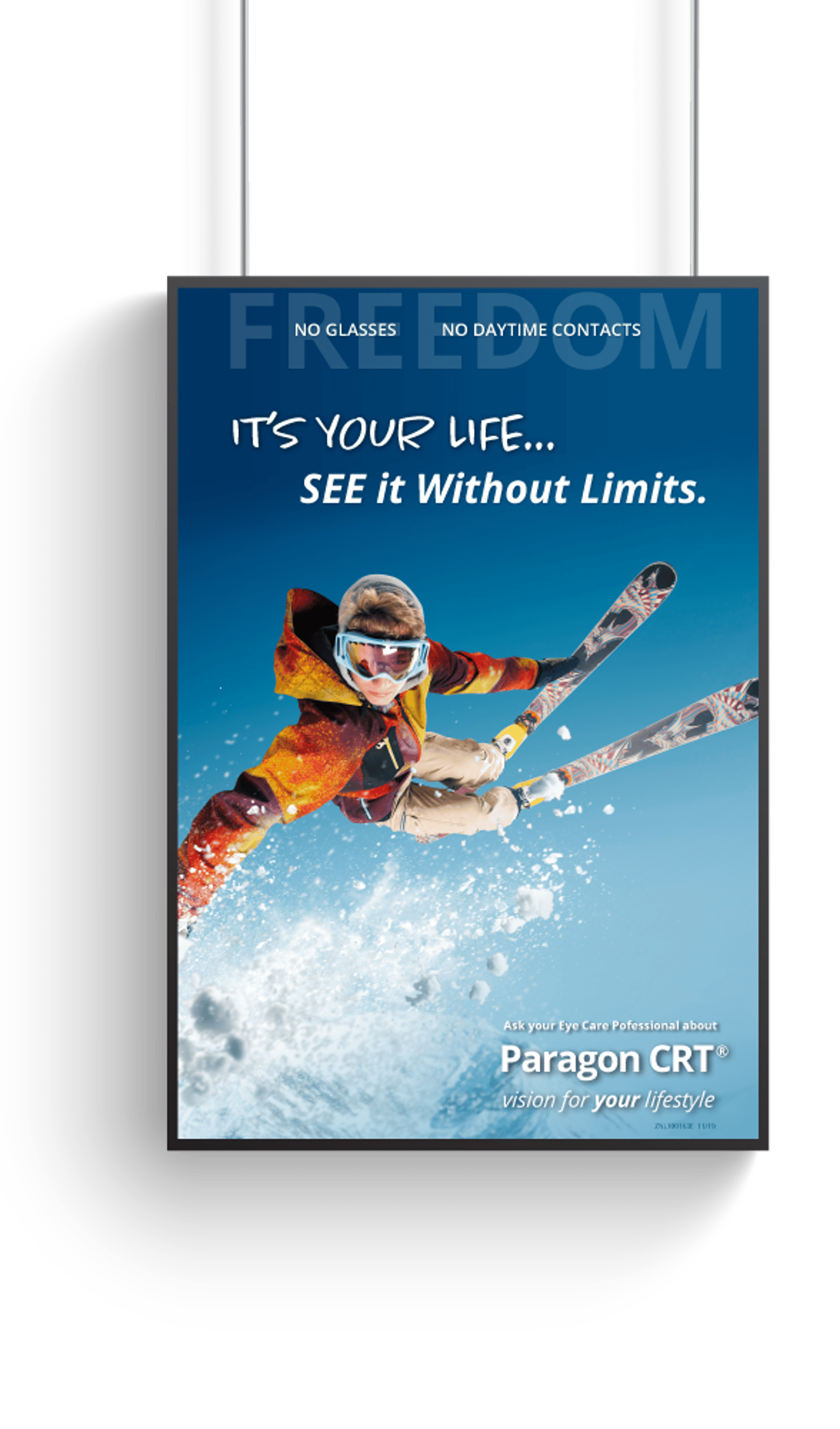
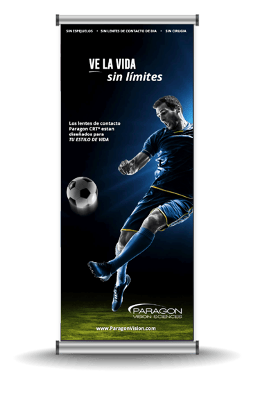
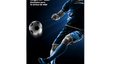
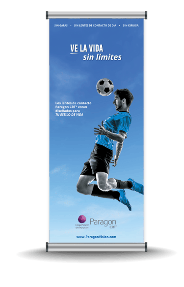
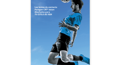
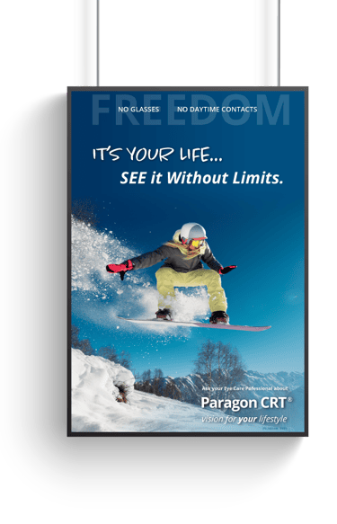
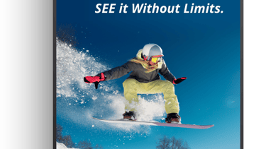
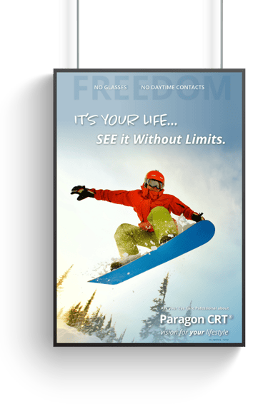
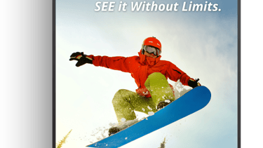
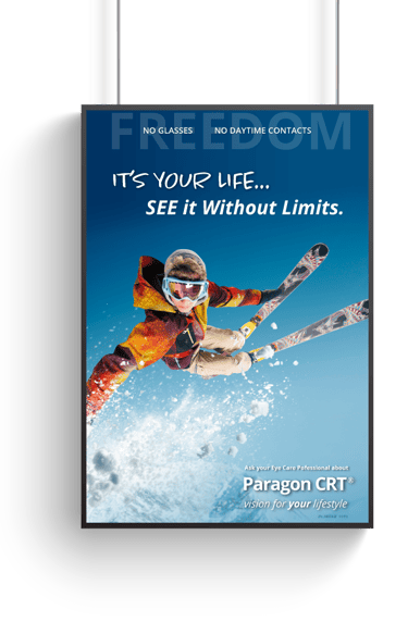
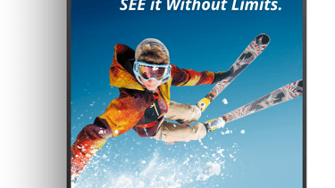
Lifestyle Campaign Launch
OVERVIEW
As part of the Paragon CRT® Lifestyle Campaign launch, this booth was designed for the Global Specialty Lens Symposium (GSLS)—one of the most prominent events in the contact lens industry. The high-impact surfer backdrop became the visual centerpiece, capturing the campaign’s core message of freedom, clarity, and confidence without daytime lenses.
The booth design brought the lifestyle narrative to life through bold visuals, dynamic color, and cohesive integration with the broader campaign identity, setting the tone for all subsequent marketing touchpoints.
Client: Paragon Vision Sciences
Role: Creative Direction, Design
Collaboration: Marketing Director
Focus: Trade Show Graphics, Campaign Launch
Banners & Posters
Versatile large-format designs for promotions, awareness campaigns, and events. Each piece combines visual impact with clear communication to capture attention across diverse environments.
Office & Environmental Design
Interior and exterior visual systems that enhance corporate spaces and connect employees and visitors to the brand’s mission. Includes office wall murals, window perfs, and interior brand touchpoints.
Office Design Wall & Backdrop
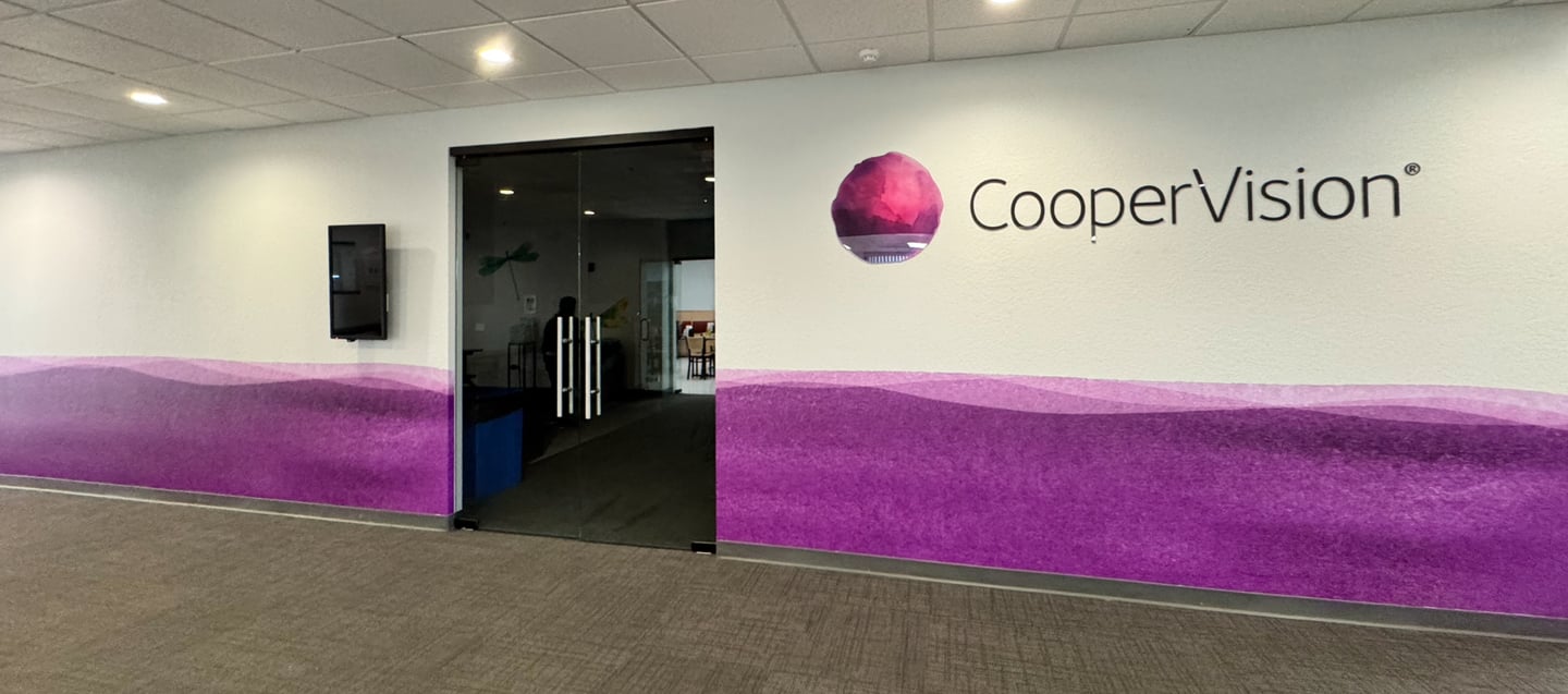
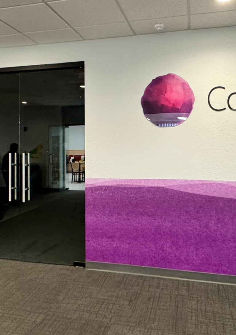
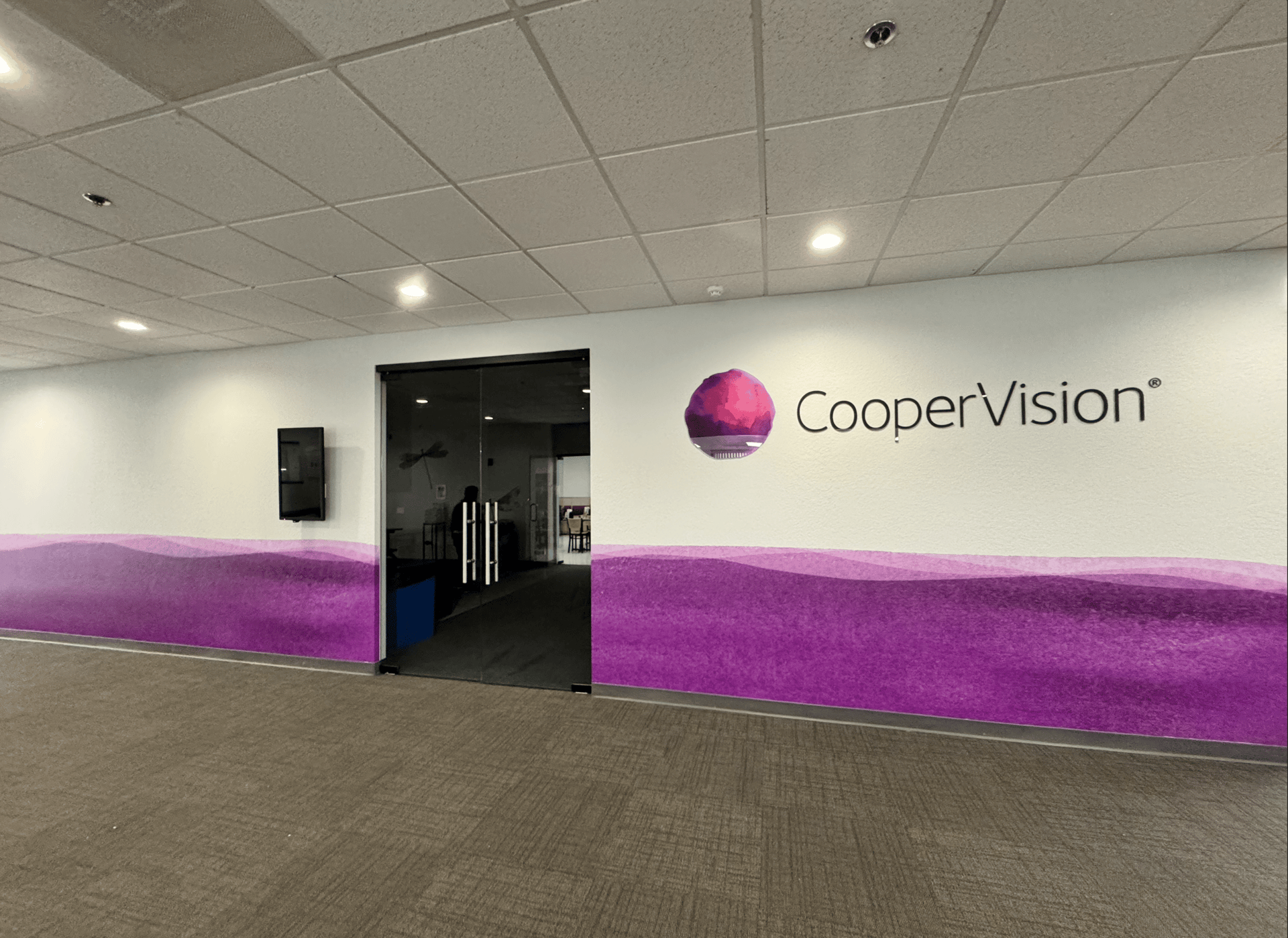
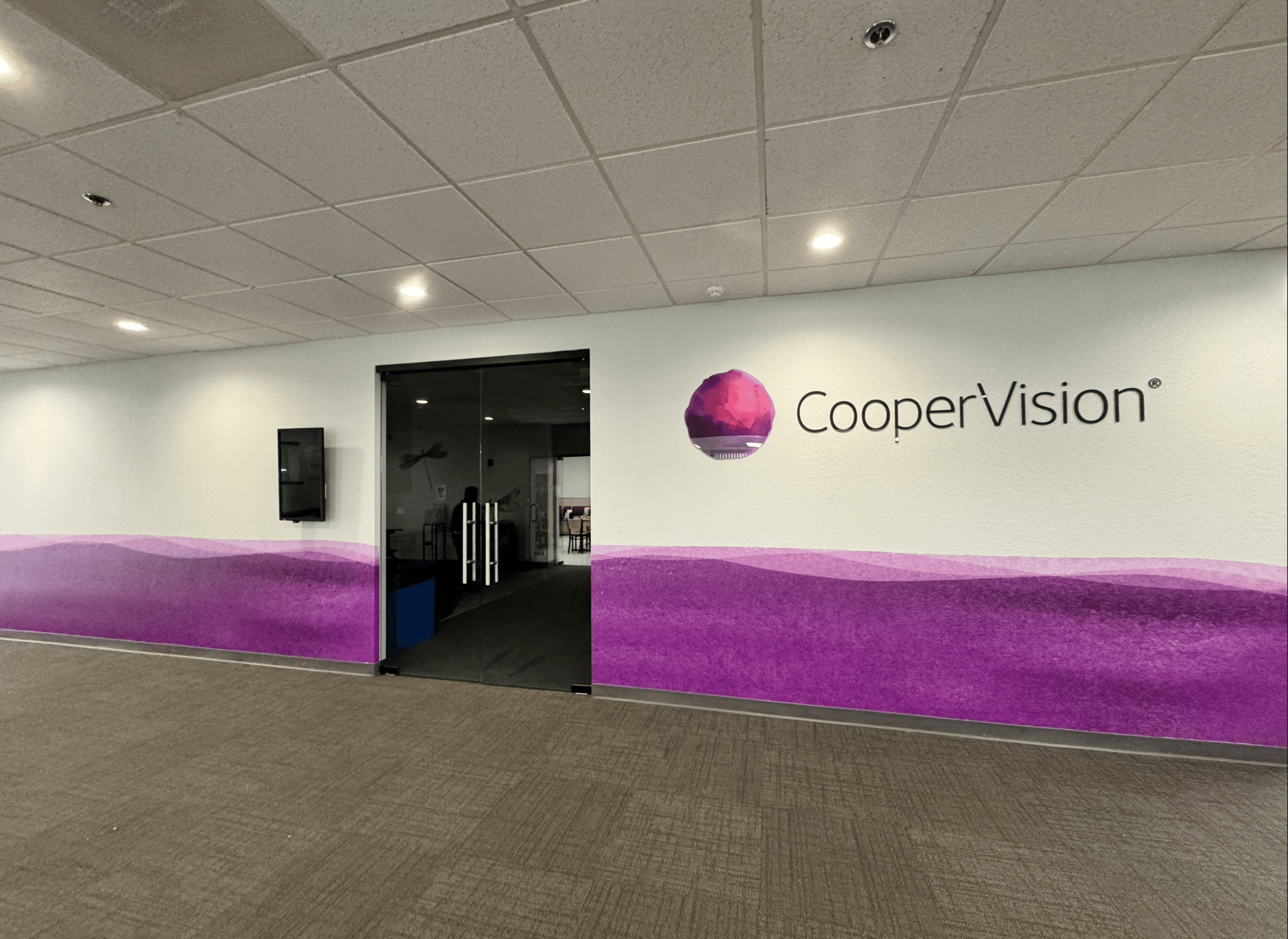
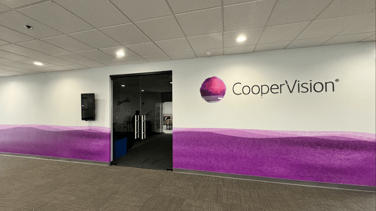
To enhance the visual appeal of the Academy at CooperVision, I incorporated a vibrant logo, strategically placed at the top of the backdrop. To maintain alignment with the brand guidelines, I also integrated signature watercolor elements at the bottom, infusing the design with a touch of creativity and warmth. This backdrop is specifically crafted to serve as an inviting setting for photographs during events held at the academy. Whether welcoming visitors or hosting doctor residents, the backdrop will not only elevate the aesthetic of the occasion but also reinforce the brand's identity.
By merging functionality with a pleasing design, the enhanced backdrop is sure to make a memorable impression on all who encounter it.
CooperVision®
Client: CooperVision
Role: Design, Brand Integration
Collaboration: Events Manager, Print company, Global MarCom, Plant Maintenance Manager.
Focus Area: Environmental Graphics, Brand Experience
Trade Shows & Large-Scale Graphics | Office & Environmental Design
Marketing Materials
A collection of printed materials designed to elevate brand communication across multiple touchpoints. From brochures and posters to banners and promotional pieces, each design reflects careful attention to visual storytelling, consistency, and audience impact.
PROJECT OVERVIEW
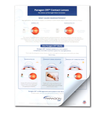
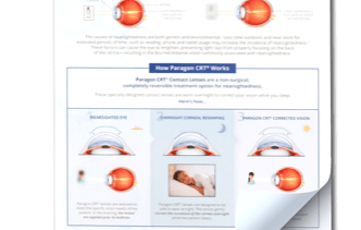
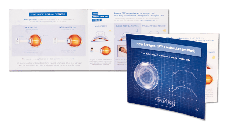
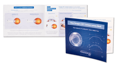
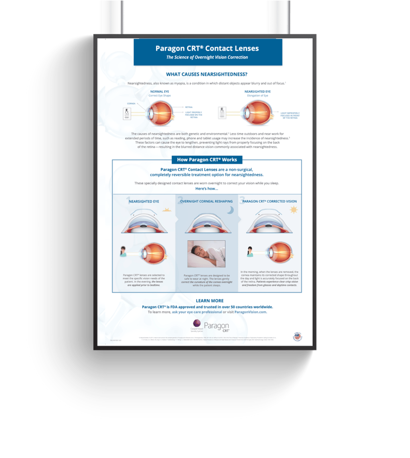
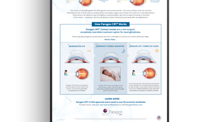
How Ortho-K Works?
The bay area of San Francisco is one of Ortho-K ( Orthokeratology) markets and is full of engineer parents who what to understand how Ortho-K works before they put their children into the treatment modality.
To answer that need for information, we created this piece that explains the physics and science behind the “magic” of Ortho-K.
+8,250
Reproductions for tear-off pads
Brochures Printed
5 Languages
+14,150
Translated into
Data from approximately 2022 (or earlier) indicates. Current figures are likely higher.
PROJECT OVERVIEW
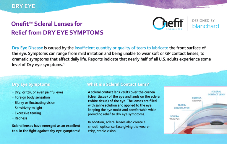
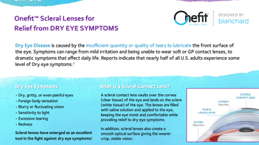
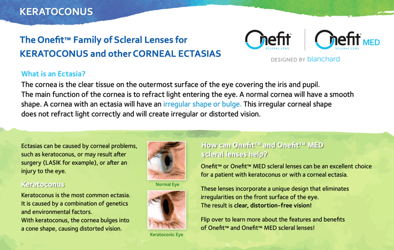
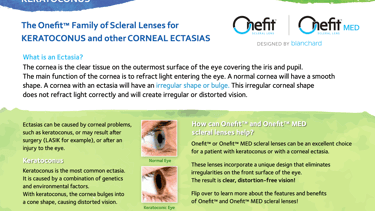
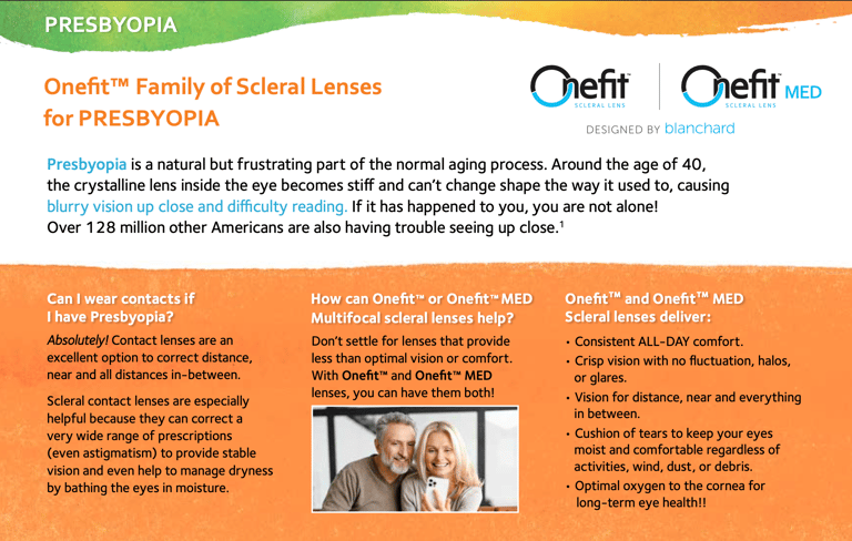
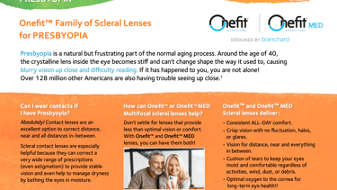
Onefit™ Info Postcard
Partnered with the product marketer for Onefit™ scleral and irregular cornea business to create a postcard campaign that addresses a range of conditions including Dry Eye, Keratoconus, and Presbyopia.
The postcards are compact – while still large enough to tell our product story - and versatile enough to be displayed in a wide variety of ways.
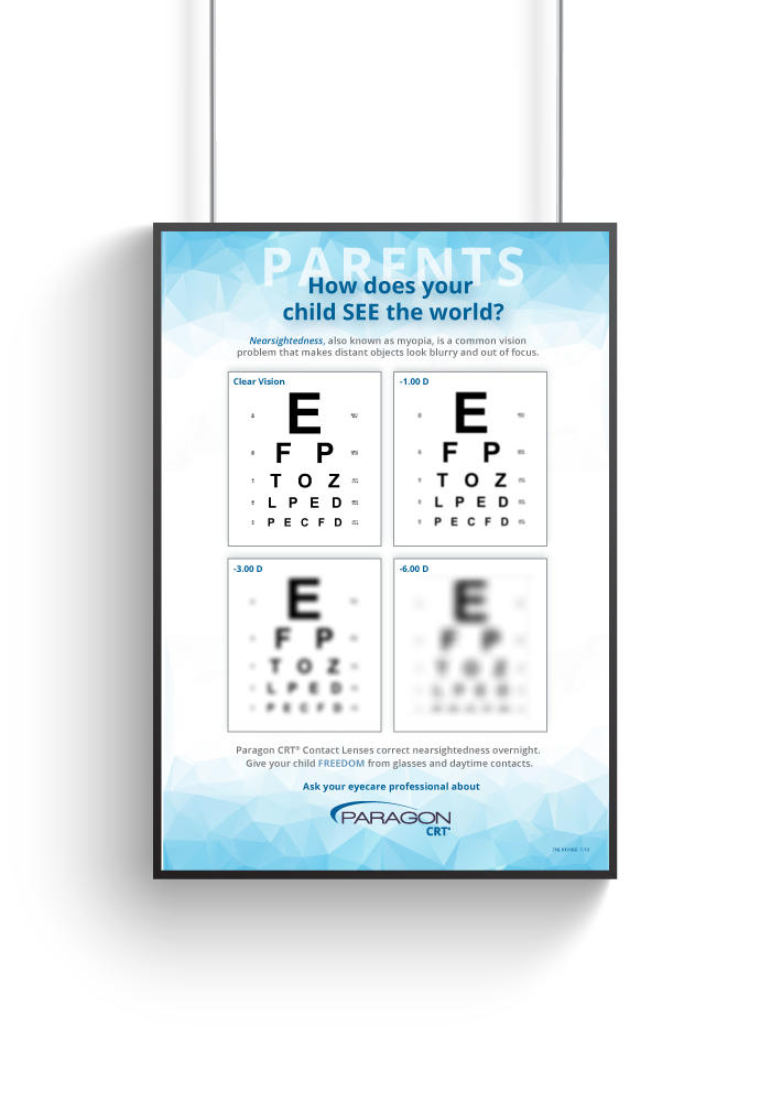
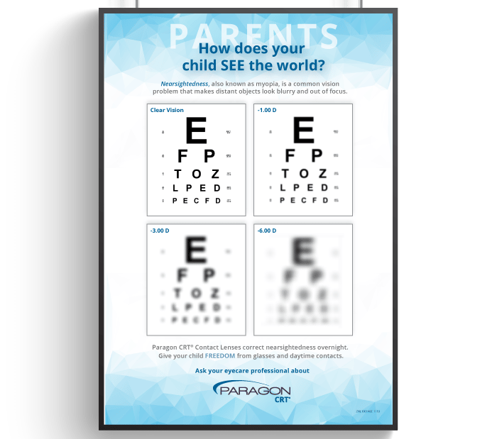
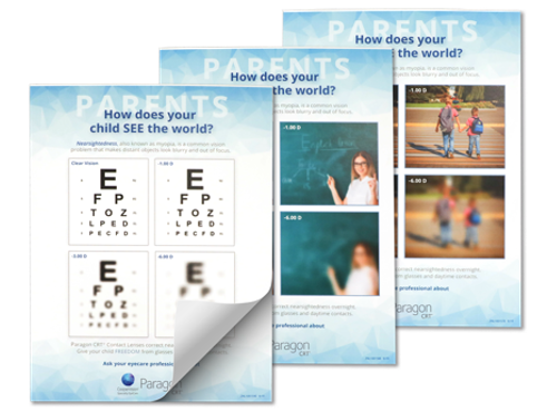
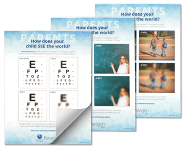
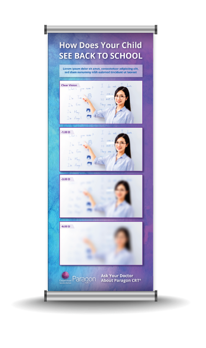

Levels of Nearsightedness
CHALLENGE
Parents often struggled to understand what their nearsighted children actually experienced. Eye care practitioners needed a visual tool to help explain varying levels of myopia in an engaging and relatable way. Before this campaign, no such standardized visual reference existed within the industry.
Role: Concept Development, Design, Visual Strategy
Collaboration: Professional Affairs, Sales Teams, Marketing Teams
Format: Stand-up banners, posters, tear-off pads, brochures
Focus: Educational Marketing, Visual Communication
Trade Shows & Large-Scale Graphics | Marketing Materials
Paragon Vision Sciences | CooperVision Specialty EyeCare
APPROACH
Developed the concept and visuals for the Levels of Nearsightedness campaign—an innovative tool showing real-world simulations of what vision looks like at different prescriptions (-1.00, -3.00, -6.00). Created across multiple formats including brochures, tear-off pads, posters, and stand-up banners. Initial versions used classroom and outdoor imagery, later expanding to sports and Snellen chart variations for broader use.
42 Banners
Ordered
Reproductions for Tear-off Pads
+21,850
Data from approximately 2022 (or earlier). Current figures are likely higher.
43 Posters
Printed
Design with Purpose.
SELSA Studio
Creative Design & Marketing
By Elsa Oroz
Get in touch
Connect
SELSAstudio@gmail.com
© 2025. All rights reserved.