Branding &
Corporate Identity
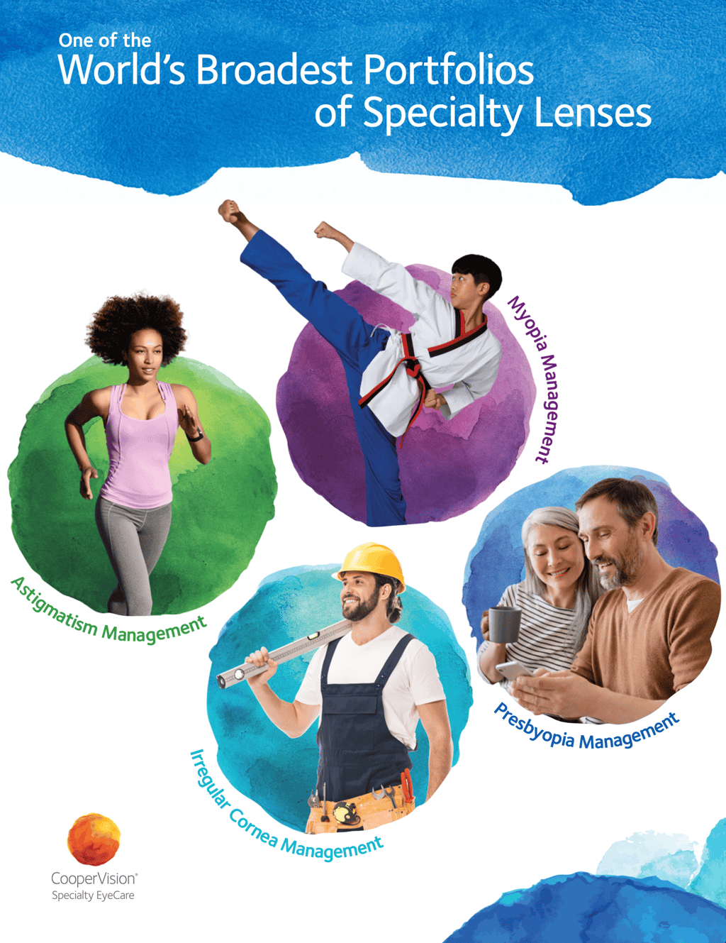
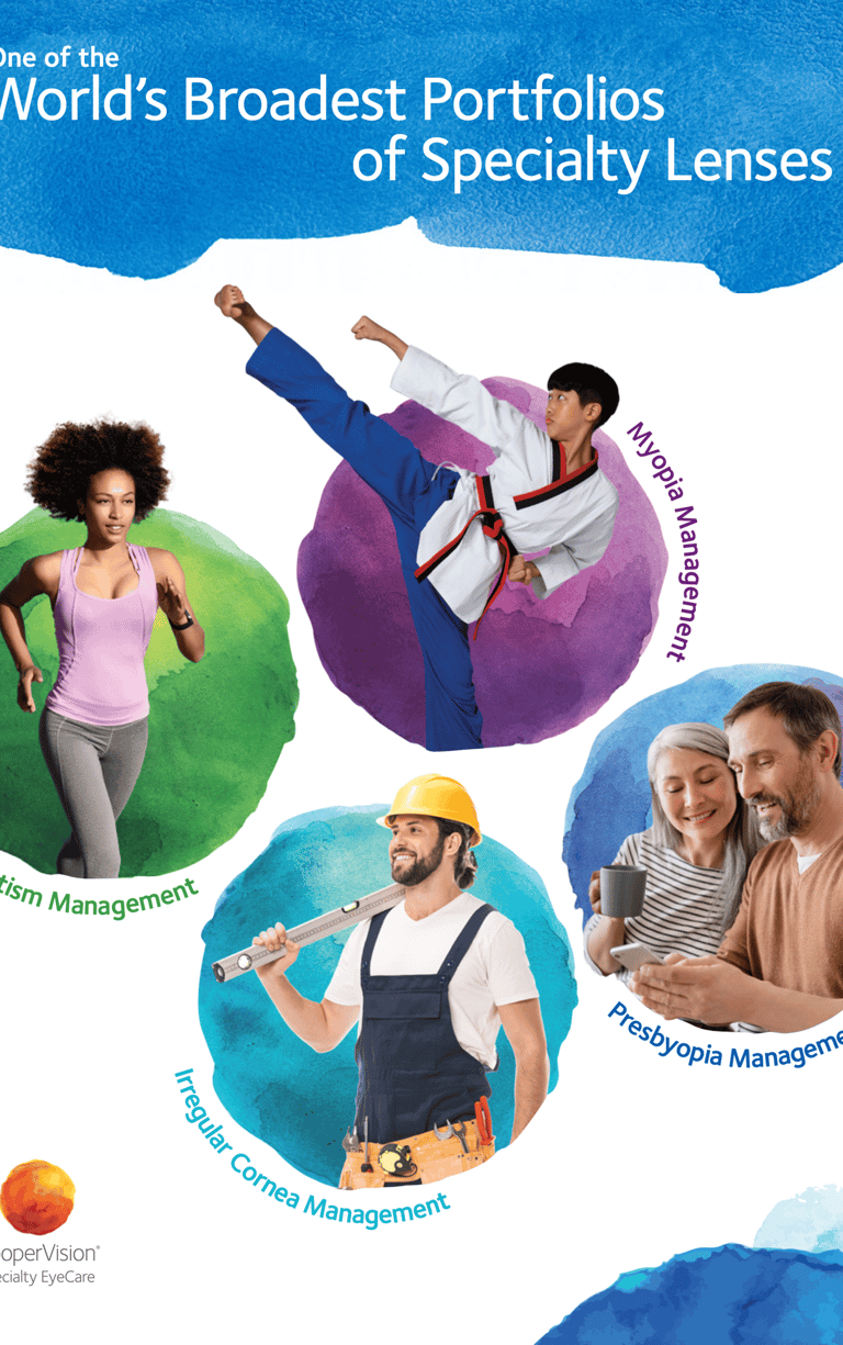
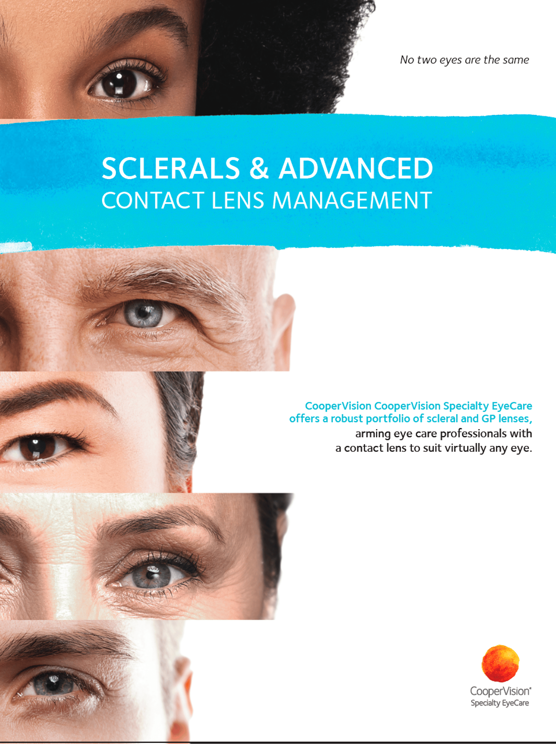
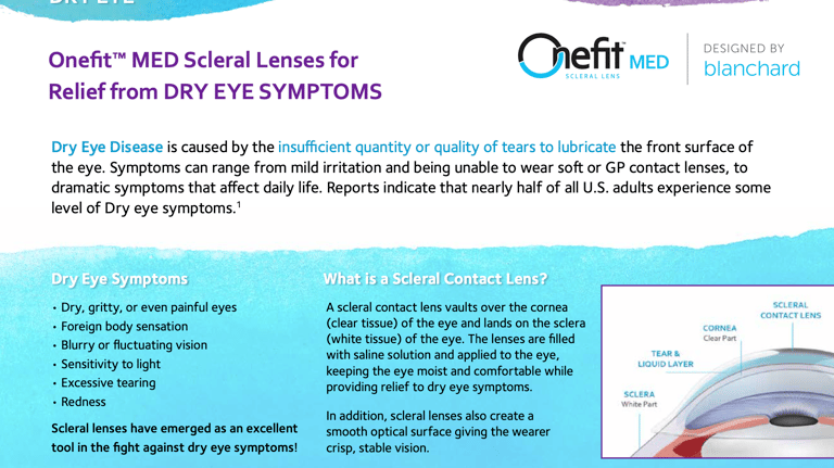
CooperVision Specialty EyeCare
Unified Product Portfolio
CHALLENGE
CooperVision had recently acquired several specialty lens brands, each with its own legacy identity, style, and marketing approach. The challenge was to bring these diverse products together into a single, unified portfolio that felt authentically “CooperVision” — consistent, professional, and aligned with their global brand language.
Branding & Corporate Identity | Unified Product Portfolio
Client: CooperVision
Role: Lead Designer, Visual Strategy.
Responsible for creating the unified visual system and brand application across multiple product lines.
Collaboration: Global marketing heads to consolidate legacy specialty lens brands — including orthokeratology (Ortho-K), scleral, and hybrid lenses — into a cohesive portfolio presentation.
Focus Areas: Visual Identity Development | Brand Integration | Marketing Collateral | Product Communication Tools
APPROACH
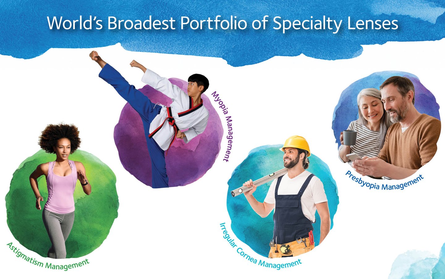
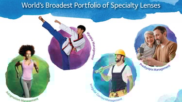
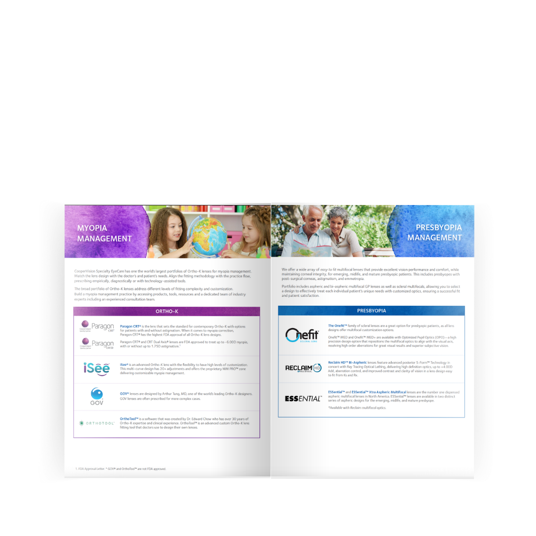
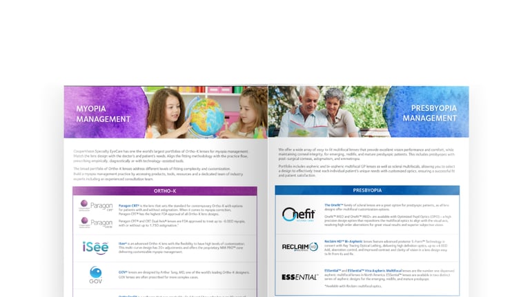
Designed a unified visual system inspired by CooperVision’s watercolor identity and brand color palette. The goal was to merge different product modalities (Ortho-K, scleral, hybrid) into a cohesive presentation that highlighted their uniqueness while reinforcing the overarching CooperVision brand.
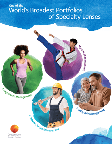
Working hand-in-hand with global marketing heads from each specialty lens category, I developed a comprehensive product dossier — a unified portfolio designed for professionals and sales teams. This printed and digital tool enabled CooperVision to present its specialty lens offerings in a consistent, brand-forward way.

Impact
UNIFIED BRANDING
Created a consistent visual system that aligned multiple specialty lens brands under the CooperVision identity.
Delivered a professional product dossier that empowered sales and marketing teams.
Strengthened CooperVision’s positioning as a trusted leader in specialty vision solutions.
SALES ENABLEMENT
MARKET CREDIBILITY
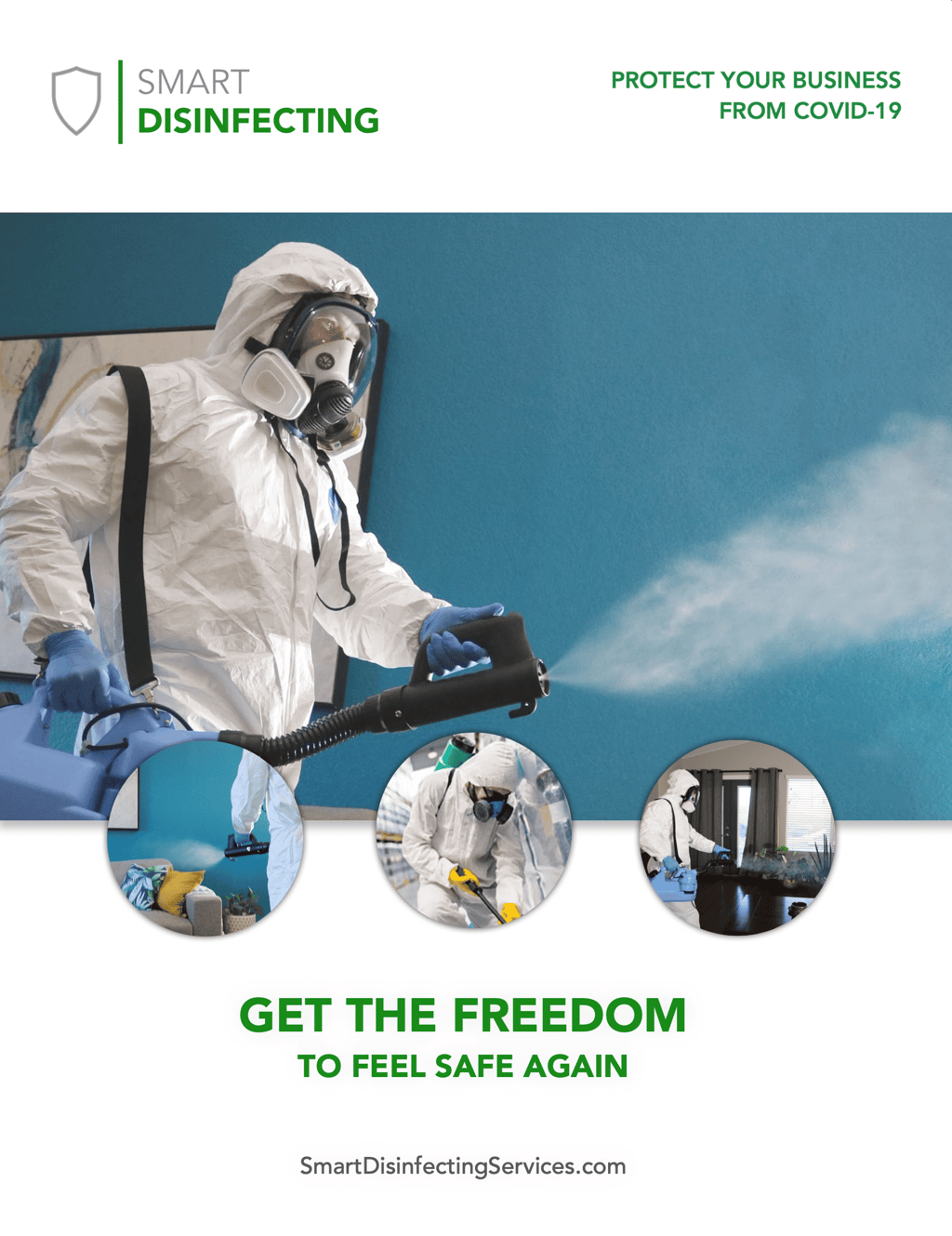
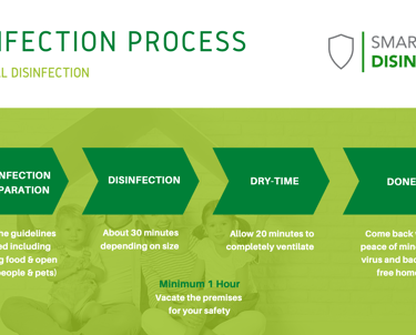
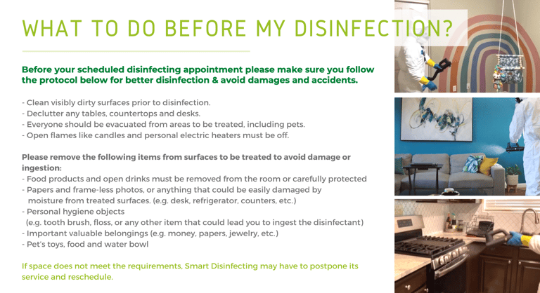
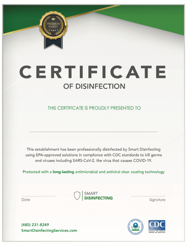
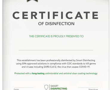
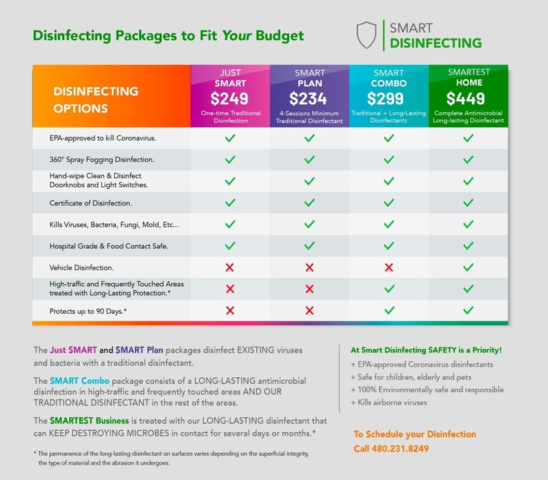
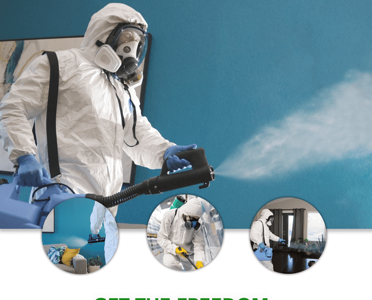
Smart Disinfecting
Services Provided
Brand identity development
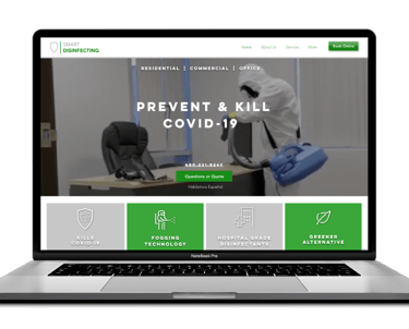
Website design and development
Marketing strategy and positioning
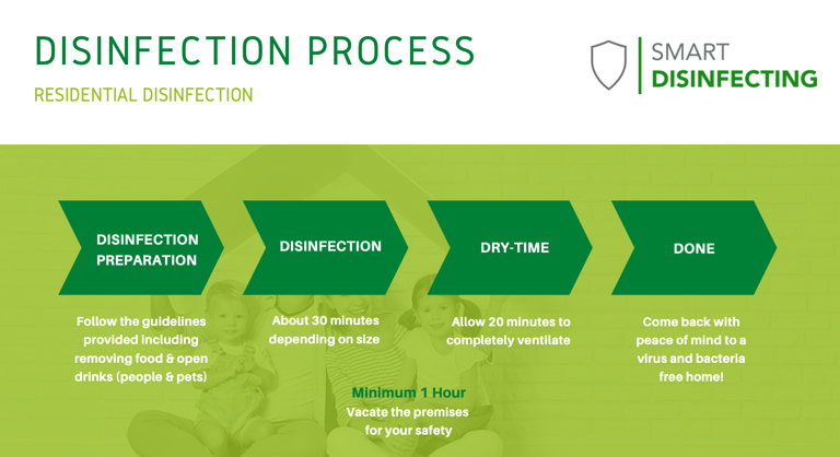
Collateral design (flyers, brochures, digital assets)
Client documents and proposals
Social media management
Brand Materials, car decals and uniforms.

Brand & Corporate Identity | Smart Disinfecting Brand Development

Smart Disinfecting Branding & Marketing
CHALLENGE
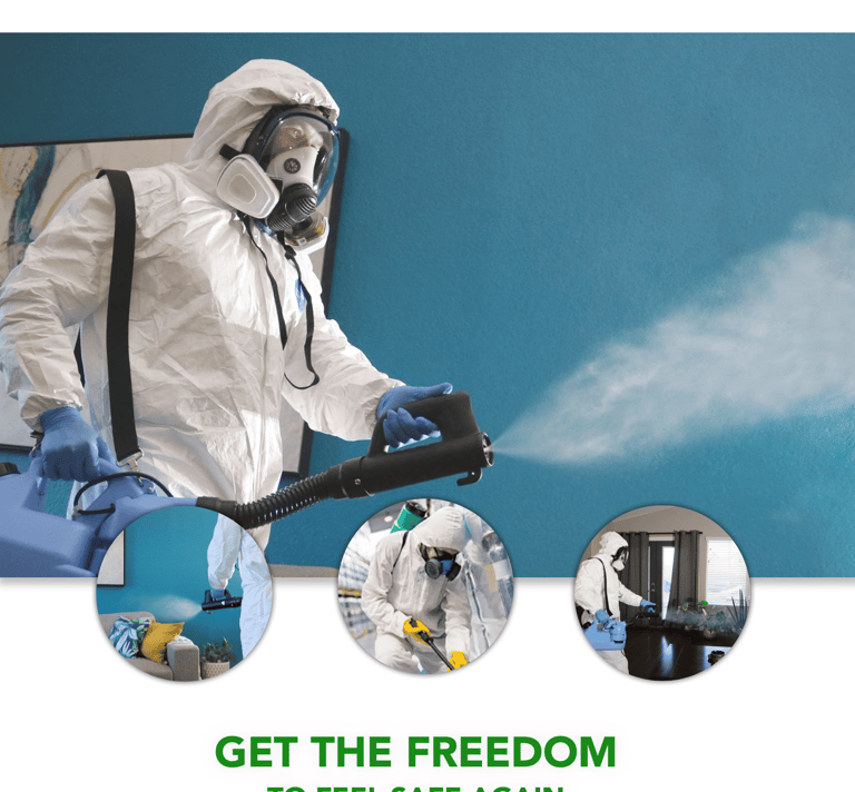
At the height of the COVID-19 pandemic, there was a surge in demand for trustworthy disinfection services. Smart DisinfectionK needed to establish itself quickly as a credible, reliable provider — in an environment where misinformation and inconsistent branding were common. The company required a professional identity and complete set of tools to communicate its services clearly and inspire confidence among both businesses and individuals.
APPROACH
We developed the identity system — from logo and visual language to website, client documents, and pricing structures — ensuring consistency and professionalism across all touchpoints. Marketing materials were crafted to communicate safety, trust, and reliability during a time of heightened public concern.

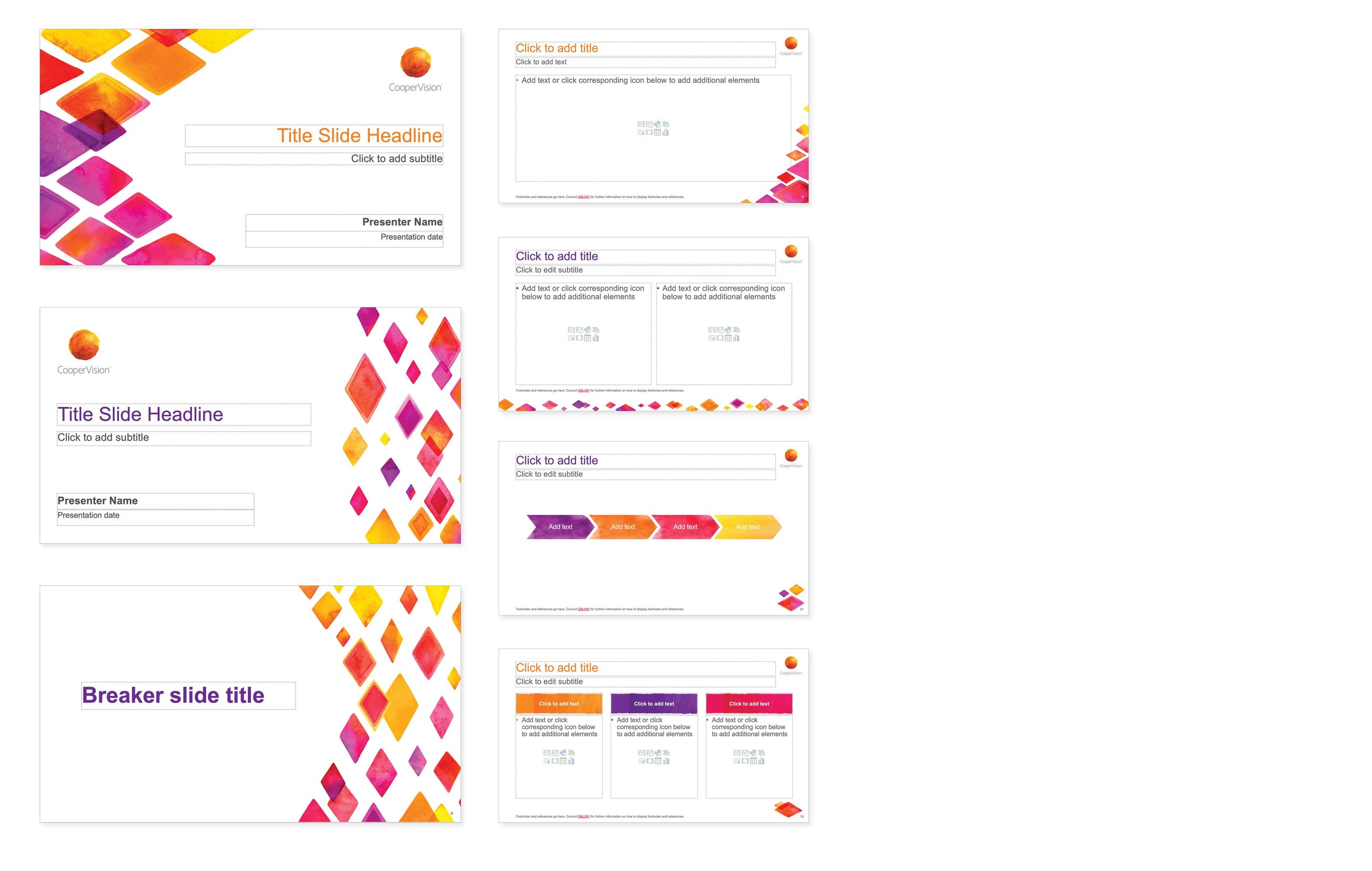
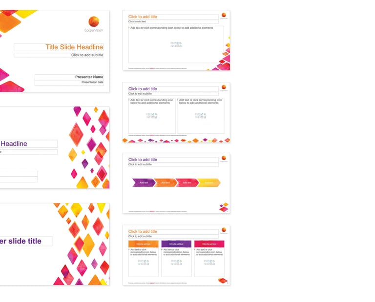
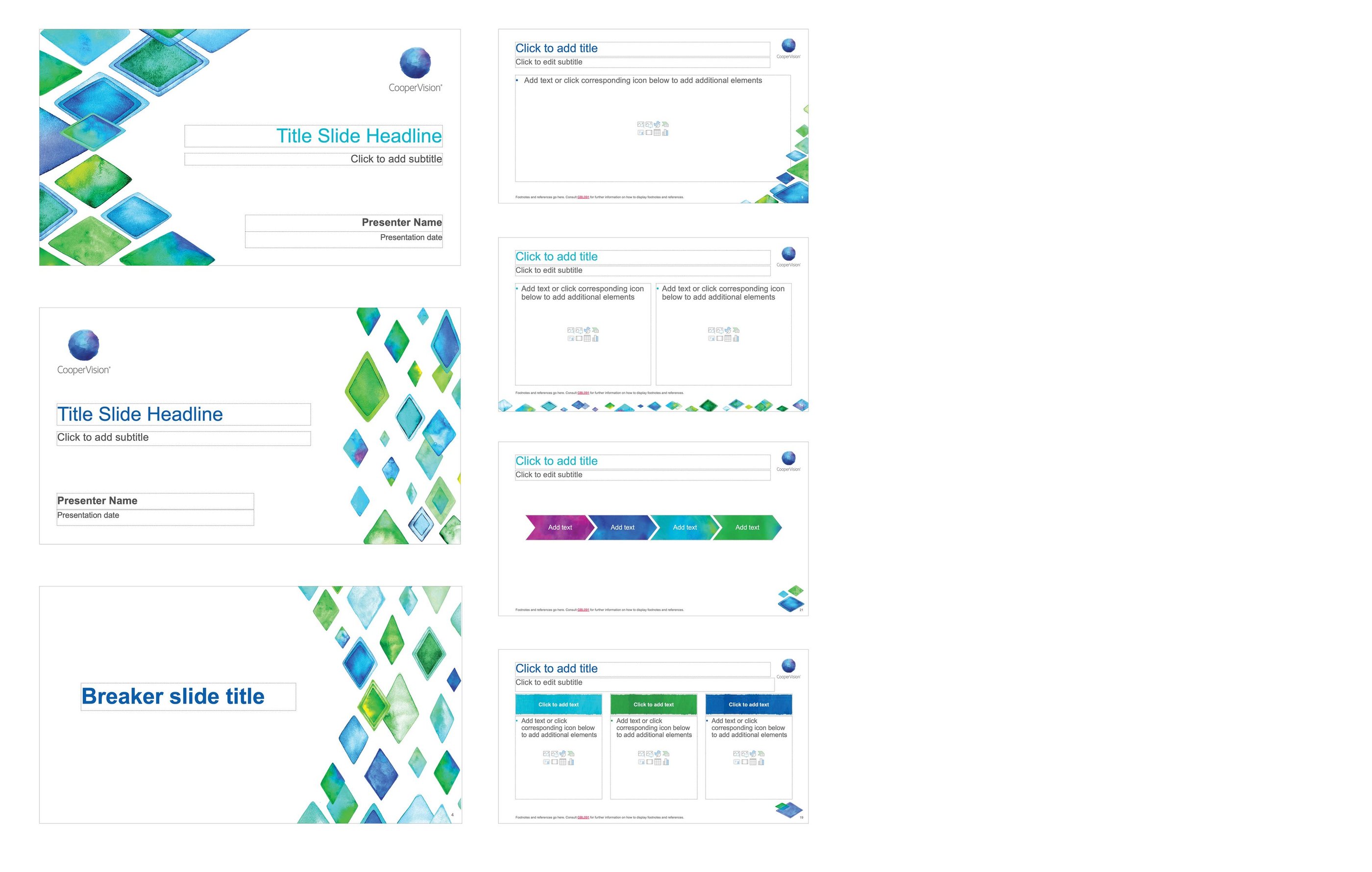
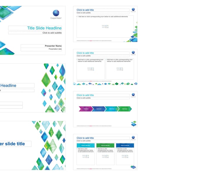
Corporate PowerPoint Templates
The corporate PowerPoint presentation developed for CooperVision incorporates watercolor elements from the master brand, creating a vibrant and engaging look that captures the essence of the brand. Each slide has been meticulously designed to ensure ample space for copy while remaining user-friendly, allowing employees to easily edit and customize the content.
Two separate presentations were created: one featuring a harmonious blend of cool tone colors, and the other with warm tone colors, The selected examples showcase a range of slides that reflect both creativity and professionalism, making it an effective tool for internal communications and presentations.
Other Branded Projects
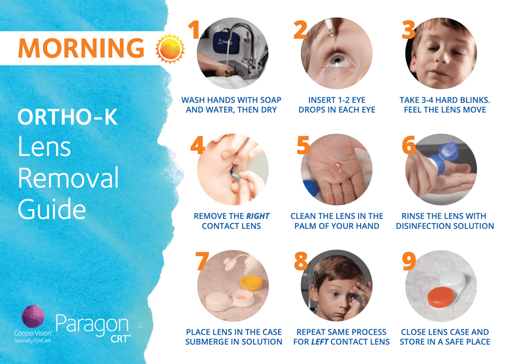
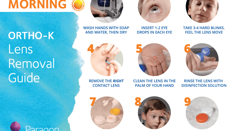
Ortho-K Application and Removal Guide

Design with Purpose.
SELSA Studio
Creative Design & Marketing
By Elsa Oroz
Get in touch
Connect
SELSAstudio@gmail.com
© 2025. All rights reserved.