
Educational &
Training Material
Clarity Through Design
We combine creative design with technical understanding to make complex lens information accessible. Our educational and training materials help contact lens professionals connect, learn, and grow with confidence.
Info Postcards >>>
Patient Consultation Guide
Certification Modules >>>
Levels of Nearsightedness >>>

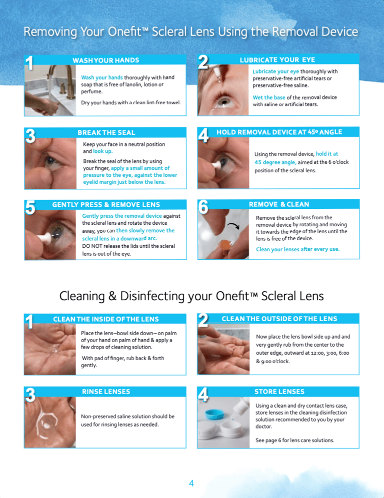
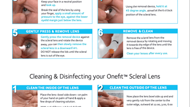
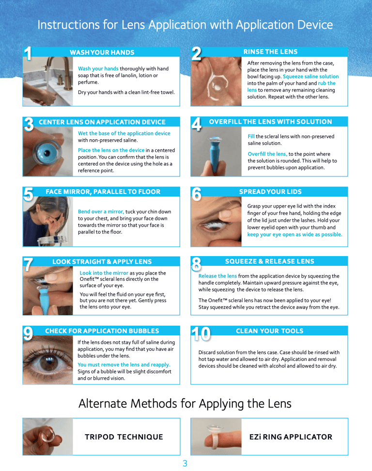
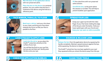
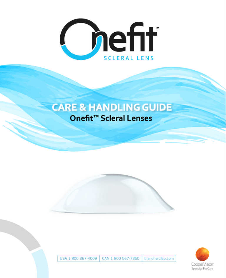
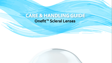
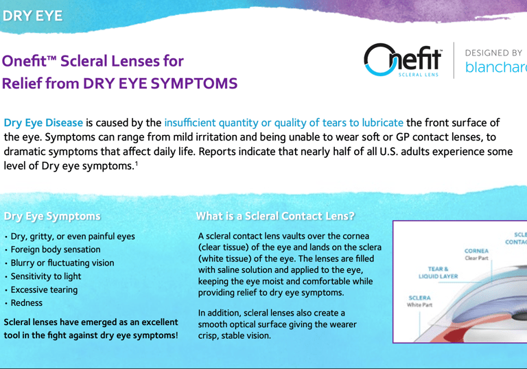
Scleral Lens Care & Handling Guide
CHALLENGE
Refresh the existing Onefit™ Scleral Lens Handling Guide to improve clarity, user experience, and visual alignment with CooperVision’s brand while communicating complex technical information.
APPROACH
Redesigned the guide from the ground up with a clean, approachable layout. Conducted in-house photography and visual analysis of the application and removal process to ensure accuracy and accessibility. Prioritized clear structure, intuitive visuals, and user-friendly flow for both practitioners and patients.
Onefit Scleral Lenses | Blanchard
Client: Blanchard | CooperVision
Role: Design, Photography, Contect Structuring
Collaboration: Marketing, print & Clinical Education Teams
Format: Laminated double-sided patient card.
Focus: Patient Education, Contact Lens Training
Educational & training Materials | Medical Device | Contact Lenses
“Sending an extra special shoutout to our incredibly talented designer
Elsa Oroz for going above and beyond to make this perfect.
While Picasso-esque perfection is simply in her nature, Elsa took this piece very seriously and personally, as she is a Onefit scleral lens wearer herself. She analyzed every aspect of the guide, comparing it to her daily application and removal experience. Elsa not only provided invaluable insights every step of the way, but also took the initiative to take high quality pictures of herself handling the lenses, filling in many gaps where our imagery was not ideal.
Thank you Elsa for your dedication in making this guide as detailed and user-friendly as it is beautiful.”
-Beth C.
Senior Manager, Marketing Communications
★★★★★
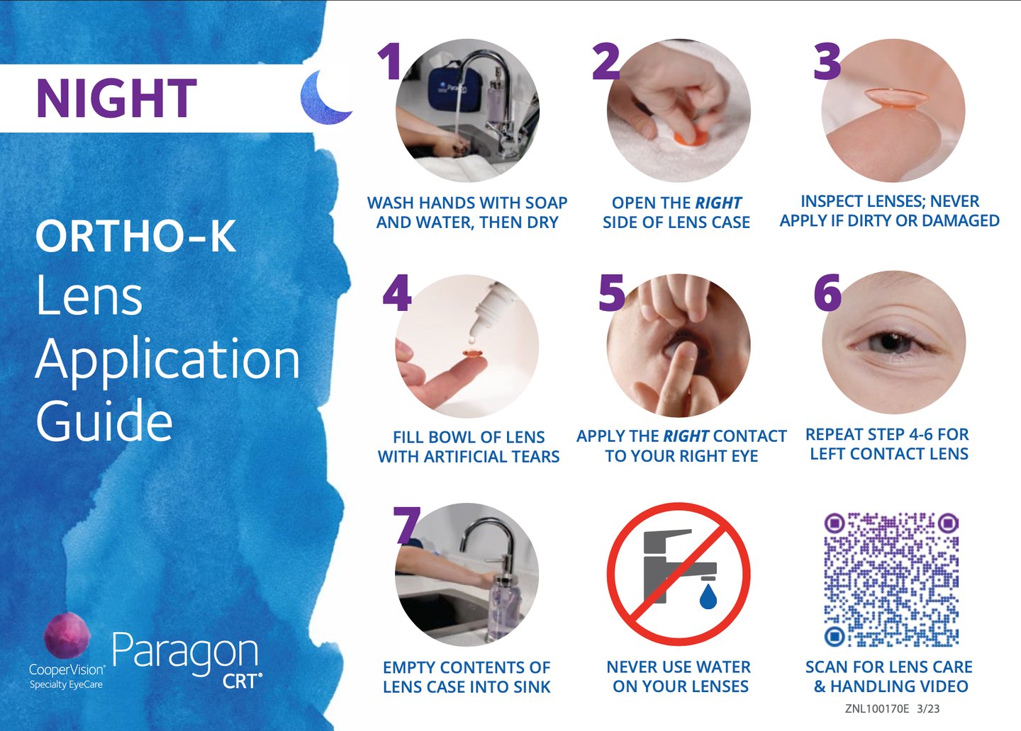
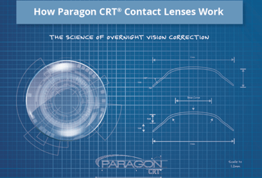
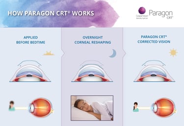
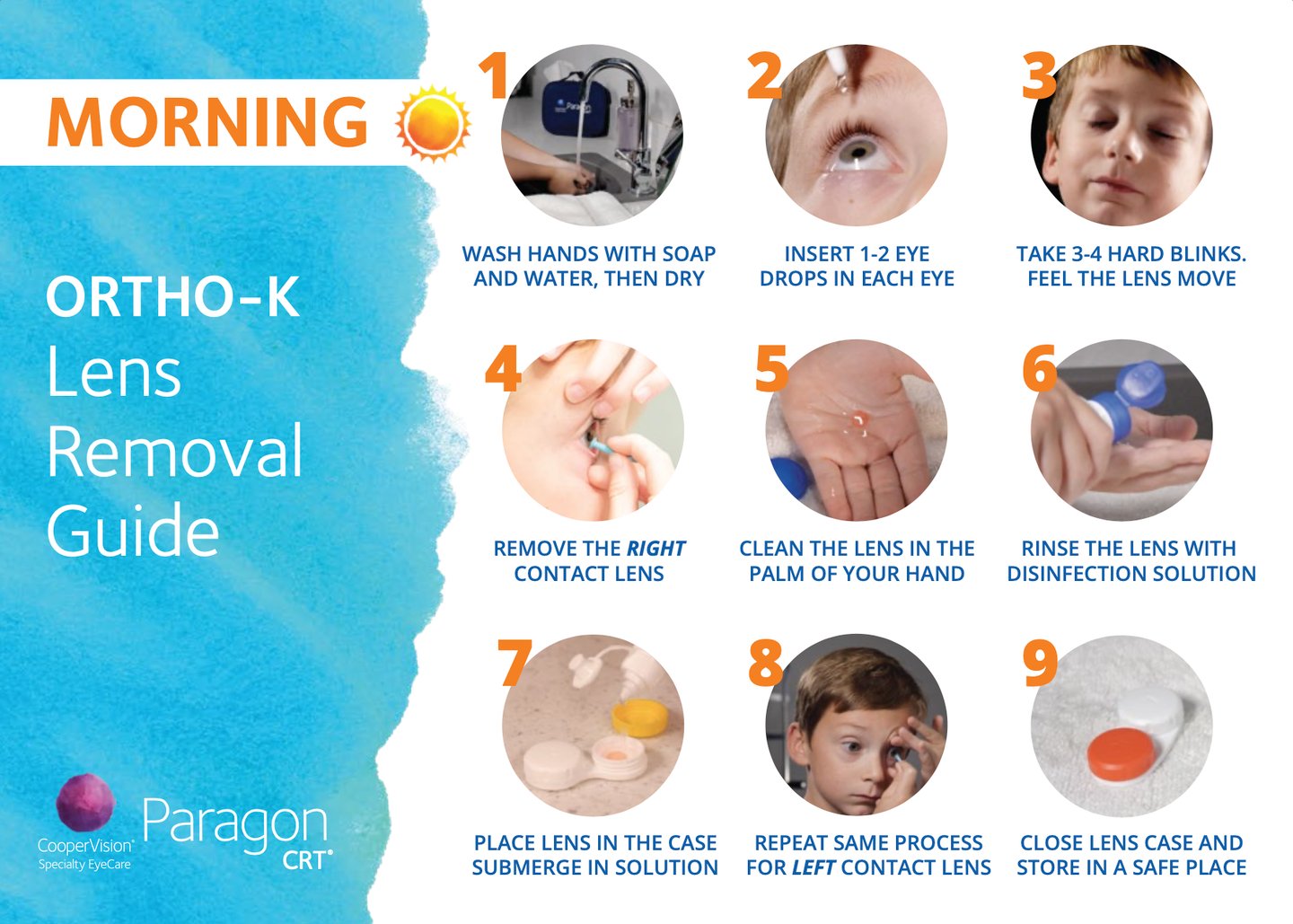
Paragon CRT®
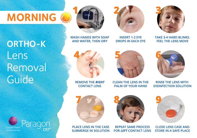
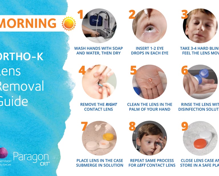
Ortho-K Lens Removal & Application Guide
CHALLENGE
Create an educational tool that simplifies the Ortho-K lens process for new wearers—particularly children—while maintaining a professional, brand-aligned look
APPROACH
Redesigned a laminated, waterproof double-sided card (one side for application, one for removal) with clear visuals, simple language, and a QR code linking to instructional videos. The design was adapted from Paragon to CooperVision’s watercolor brand style.
Client: Paragon Vision Sciences | CooperVision
Role: Visual Design, Brand Adaptation
Collaboration: Marketing, print & Clinical Education Teams
Format: Laminated double-sided patient card.
Audience: Pediatric and Teen Ortho-K users.
Focus: Patient Education, Contact Lens Training
Educational & training Materials | Medical Device | Contact Lenses
Impact
IMPROVED UNDERSTANDING
Simplified learning for new wearers, especially younger users.
Supported clinicians in effectively teaching scleral lens and Ortho-K care
Reduced practitioner chair time through clearer patient guidance.
EDUCATIONAL VALUE
CLINIC EFFICIENCY
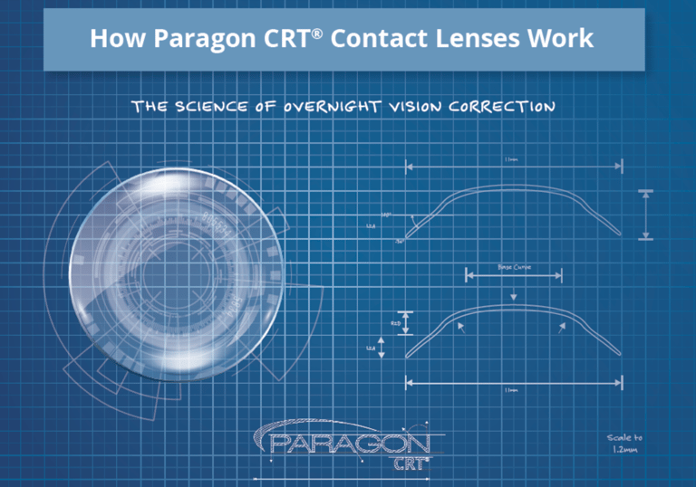
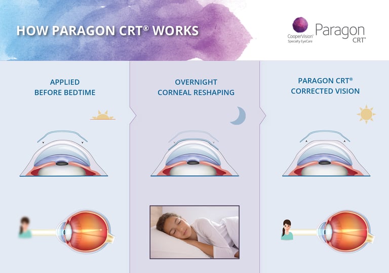
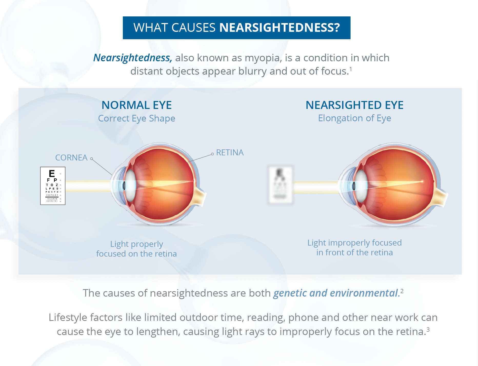
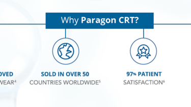
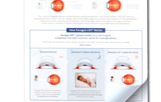
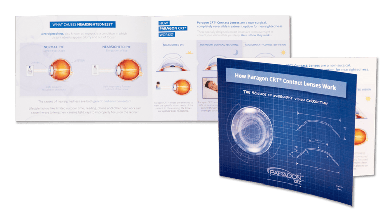
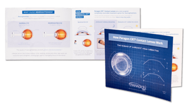
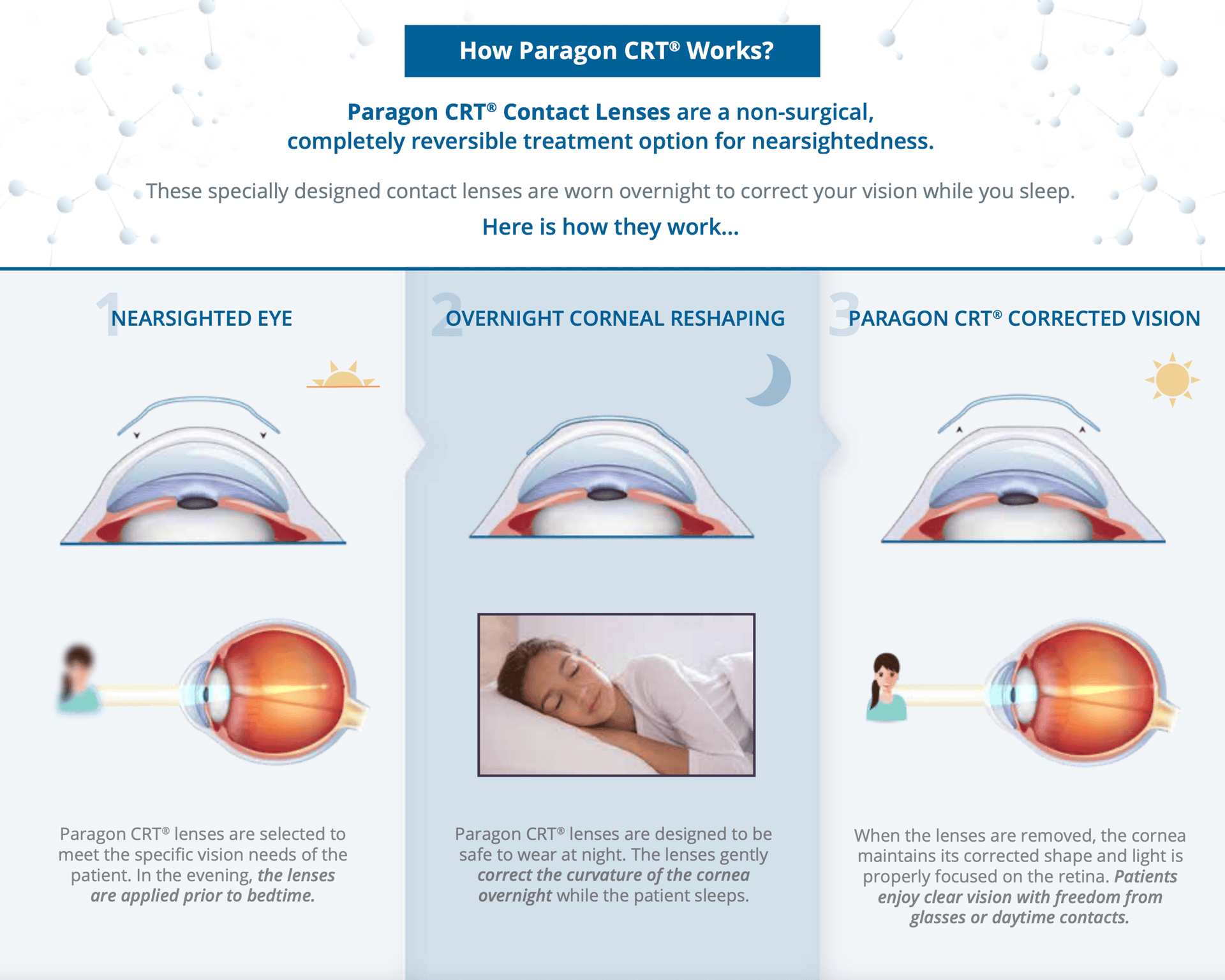
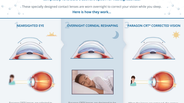
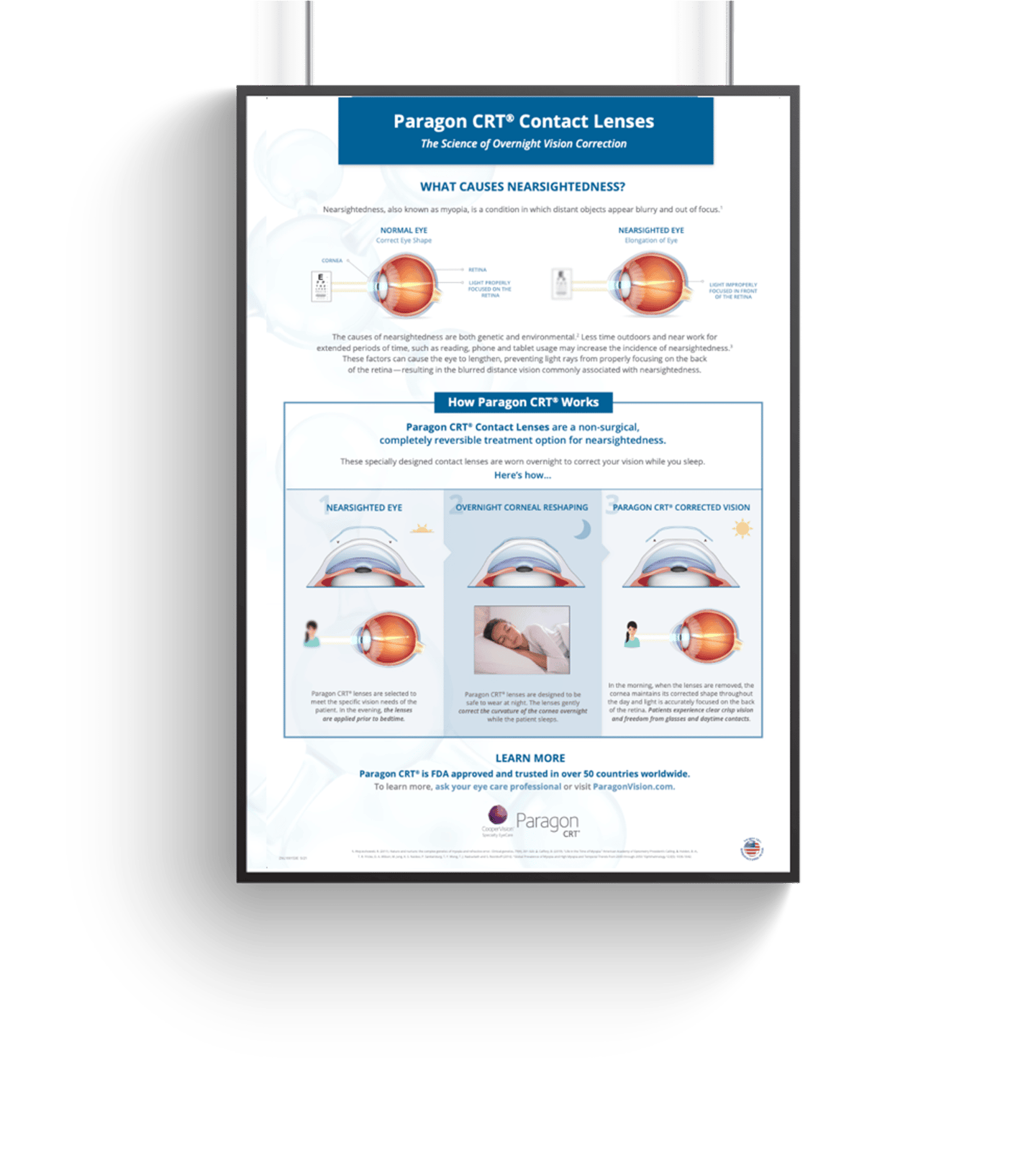
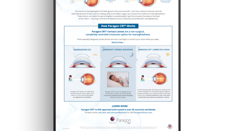
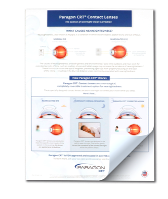
How Ortho-K Works?
CHALLENGE
In the San Francisco Bay Area—one of the key markets for Orthokeratology (Ortho-K)—parents with technical and engineering backgrounds wanted to understand the science behind the treatment before choosing it for their children. The existing materials were either too clinical or too simplistic, creating a gap in comprehension.

Role: Visual Design, Content Structuring, Visual Storytelling
Collaboration: Marketing, Professional Affairs, Product Design
Format: Brochures, posters, Tear-off pads
Audience: Patient Education
Educational & training Materials | Medical Device | Contact Lenses
Paragon Vision Sciences | CooperVision Specialty EyeCare
+8,250
Reproductions for tear-off pads
Brochures Printed
5 Languages
+14,150
Translated into
Data from approximately 2022 (or earlier) indicates. Current figures are likely higher.
Impact
APPROACH
Developed a suite of educational materials including a brochure (bi-fold and tri-fold versions), tear-off pad, and poster. The content was designed to simplify complex lens physics while maintaining scientific integrity. Collaborated with professional affairs and lens product designers to ensure accuracy and clarity. The final design balanced educational depth with an approachable visual style aligned with CooperVision branding.
Impact
SCIENTIFIC CLARITY
Simplified complex optical concepts into engaging,
easy-to-understand visuals.
Helped parents make informed decisions about Ortho-K treatment.
Strengthened the company's position as an educational leader in specialty eye care.
MARKET ENGAGEMENT
BRAND CREDIBILITY
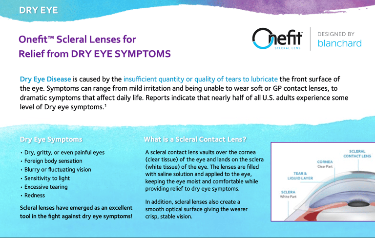
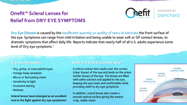
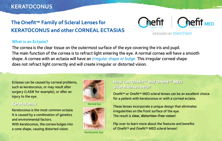
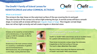
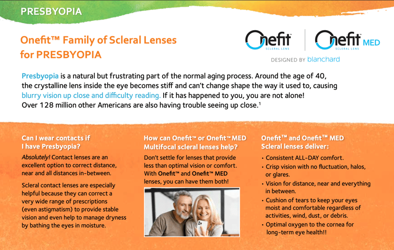
Scleral Lens | Info Postcard
CHALLENGE
The existing Onefit™ scleral and irregular cornea postcards needed a visual and strategic refresh to better communicate key conditions—Dry Eye, Keratoconus, and Presbyopia—while aligning with CooperVision’s updated brand identity. The previous materials felt dated and disconnected from the new look and tone of the global brand.
Role: Visual Design, Creative Direction, Layout, Brand Transition
Collaboration: Product Marketing & Professional Affairs
Format: Printed Postcard
Focus: Product Communication, Patient Education
APPROACH
Collaborated with the product marketing team to redesign the postcards, unifying legacy Onefit™ materials under the CooperVision aesthetic. Created a clean, bright, and approachable design that maintained scientific integrity while making the content accessible to both practitioners and patients. The compact postcard format allowed for versatility—ideal for displays, events, or direct distribution.
IMPACT
Brand Cohesion: Brought legacy materials into alignment with CooperVision’s watercolor-based visual language.
Visual Appeal: Elevated perception of the product line with a fresh, modern aesthetic.
Educational Reach: Simplified technical conditions into clear, patient-friendly communications.
Educational & training Materials | Medical Device | Contact Lenses
Blanchard Labs | CooperVision Specialty EyeCare
MiSight® Clinical Data Infographics
CHALLENGE
Hospital reports and clinical data were dense and difficult for Eye Care Practitioners (ECPs) to quickly interpret. Complex numerical and technical information needed to be more accessible, engaging, and actionable for practitioners reviewing patient or product data.
Role: Visual Design, Data Visualization
Collaboration: Professional Affairs & Clinical Teams
Format: Digital Hospital Report Magazine
Focus: Clinical Communication, Infographics, Healthcare Education
APPROACH
Developed a series of visually compelling infographics that summarized complex clinical data. Leveraged the MiSight® brand palette and integrated CooperVision’s watercolor master brand elements to ensure both brand consistency and visual appeal. Focused on clear, concise visuals paired with essential data to make information intuitive, engaging, and easy to comprehend.
Educational & training Materials | Medical Device | Contact Lenses
MiSight | CooperVision
Transformed complex hospital reports into visually engaging infographics, making critical clinical data easy to understand and actionable for Eye Care Practitioners.
IMPROVED CLARITY
Infographics aligned with both MiSight® identity and CooperVision’s overarching brand.
Supported more efficient communication and better-informed decision-making in clinical settings.
BRAND COHESION
ENHANCED ENGAGEMENT
Impact
Simplified complex clinical data into digestible visuals for ECPs.
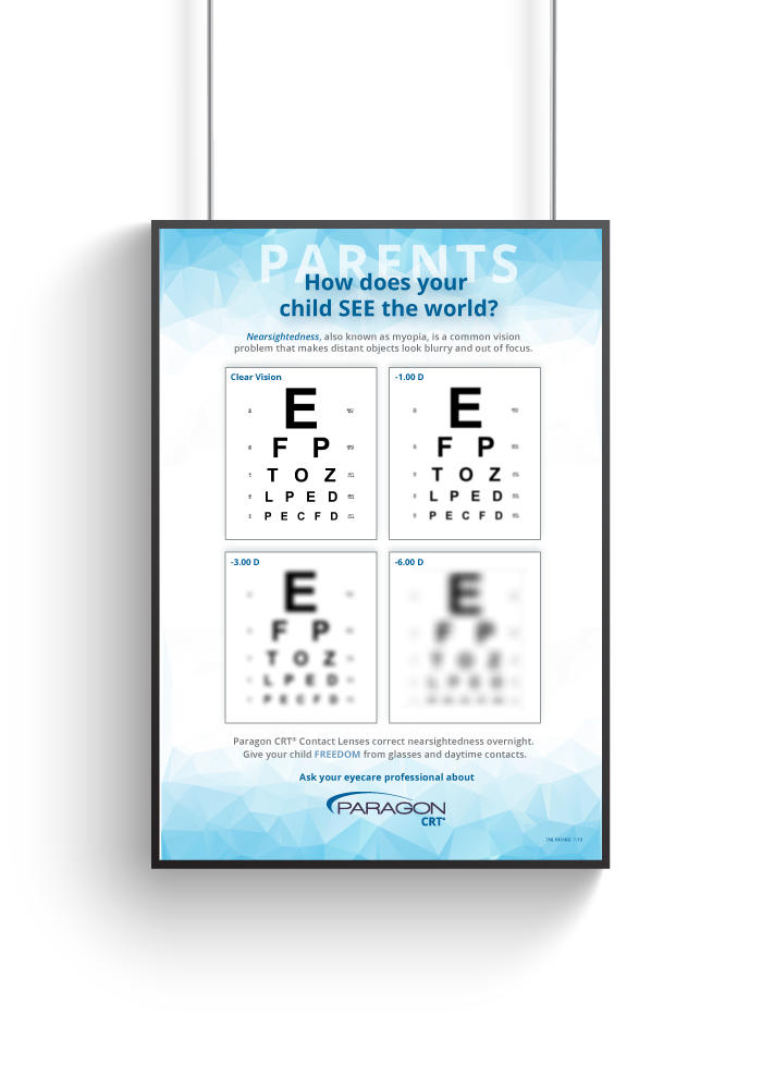
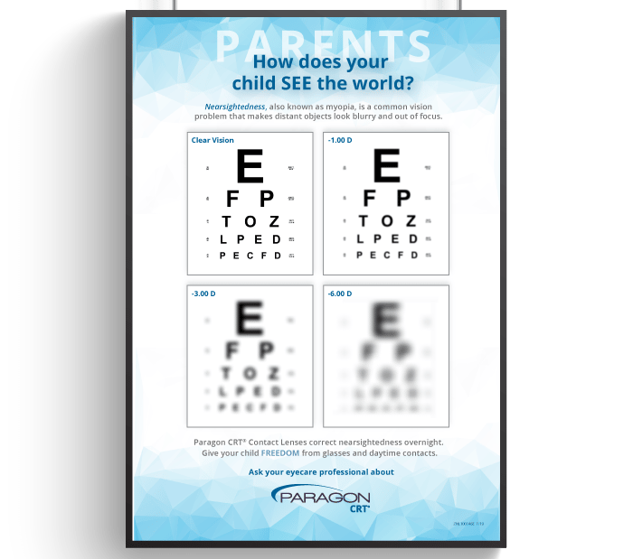
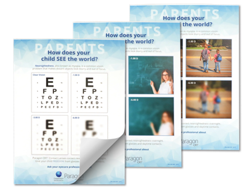
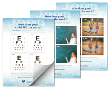


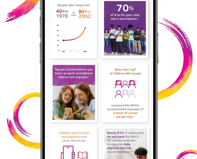
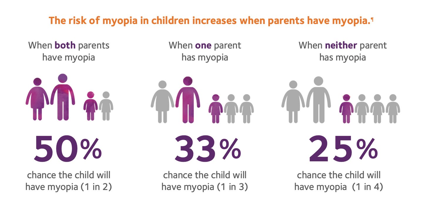
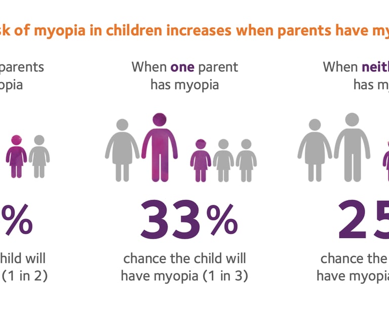
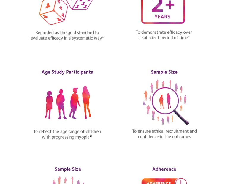
Levels of Nearsightedness
CHALLENGE
Parents often struggled to understand what their nearsighted children actually experienced. Eye care practitioners needed a visual tool to help explain varying levels of myopia in an engaging and relatable way. Before this campaign, no such standardized visual reference existed within the industry.
Role: Concept Development, Design, Visual Strategy
Collaboration: Professional Affairs, Sales Teams, Marketing Teams
Format: Stand-up banners, posters, tear-off pads, brochures
Focus: Educational Marketing, Visual Communication
Educational & training Materials | Medical Device | Contact Lenses
Paragon Vision Sciences | CooperVision Specialty EyeCare
APPROACH
Developed the concept and visuals for the Levels of Nearsightedness campaign—an innovative tool showing real-world simulations of what vision looks like at different prescriptions (-1.00, -3.00, -6.00). Created across multiple formats including brochures, tear-off pads, posters, and stand-up banners. Initial versions used classroom and outdoor imagery, later expanding to sports and Snellen chart variations for broader use.
42 Banners
Ordered
Reproductions for Tear-off Pads
+21,850
Data from approximately 2022 (or earlier). Current figures are likely higher.
43 Posters
Printed
Impact
Ortho-K Lens Fitting
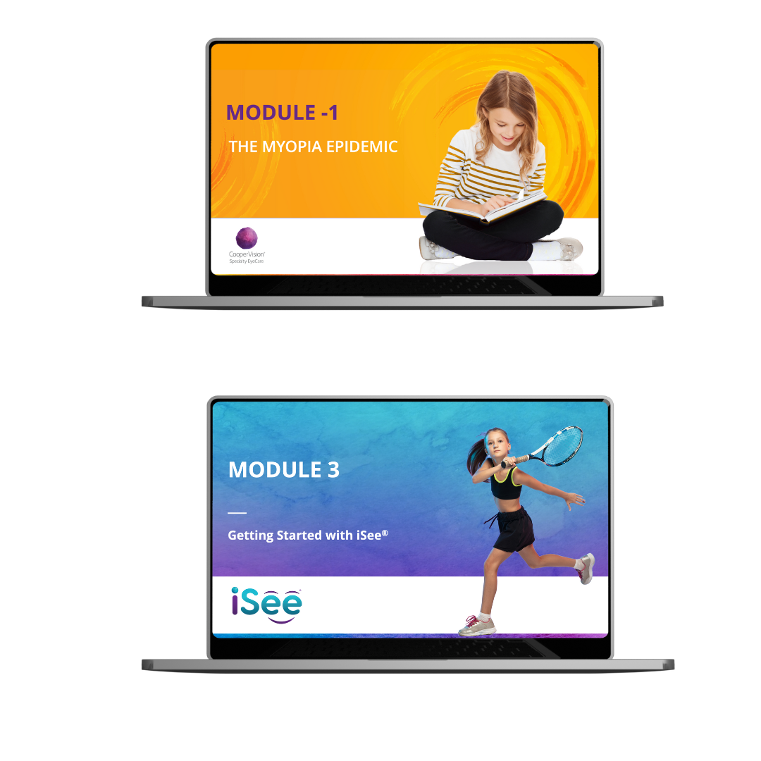
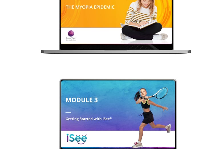
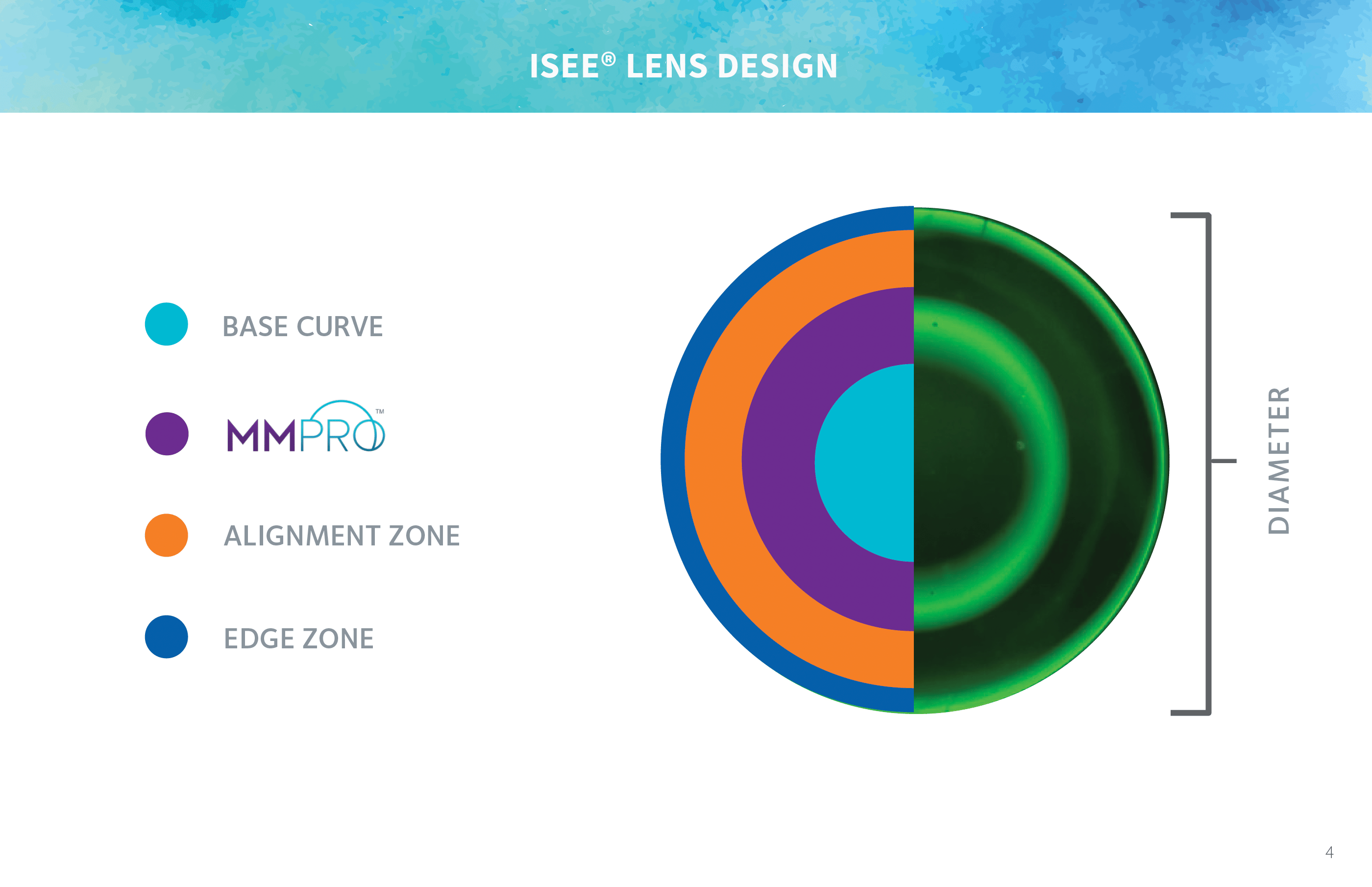
Certification Modules
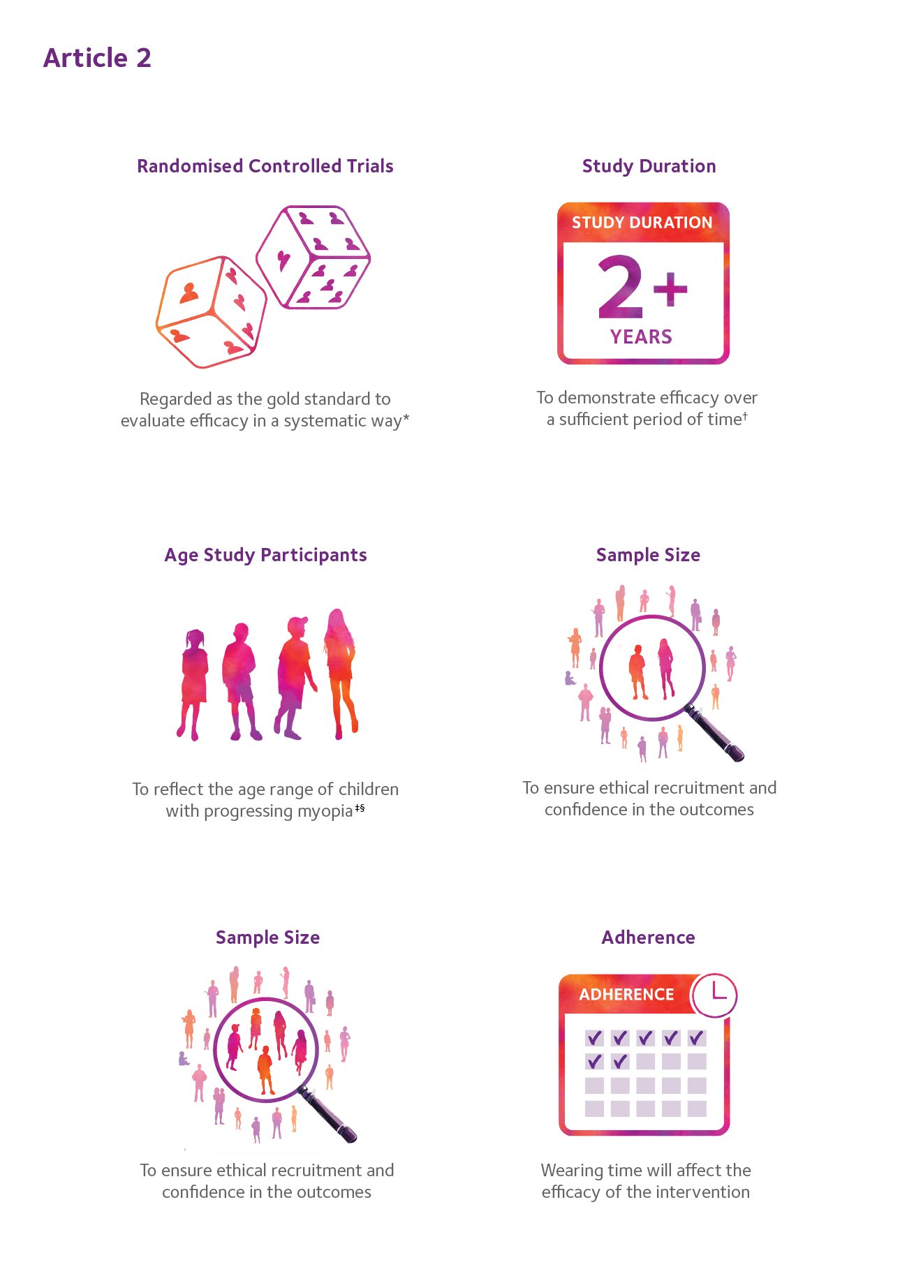
CHALLENGE
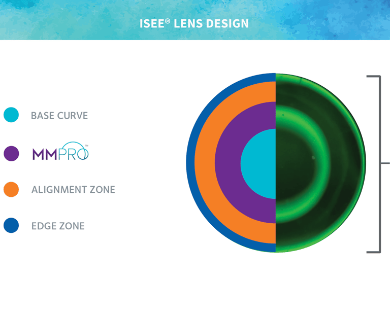
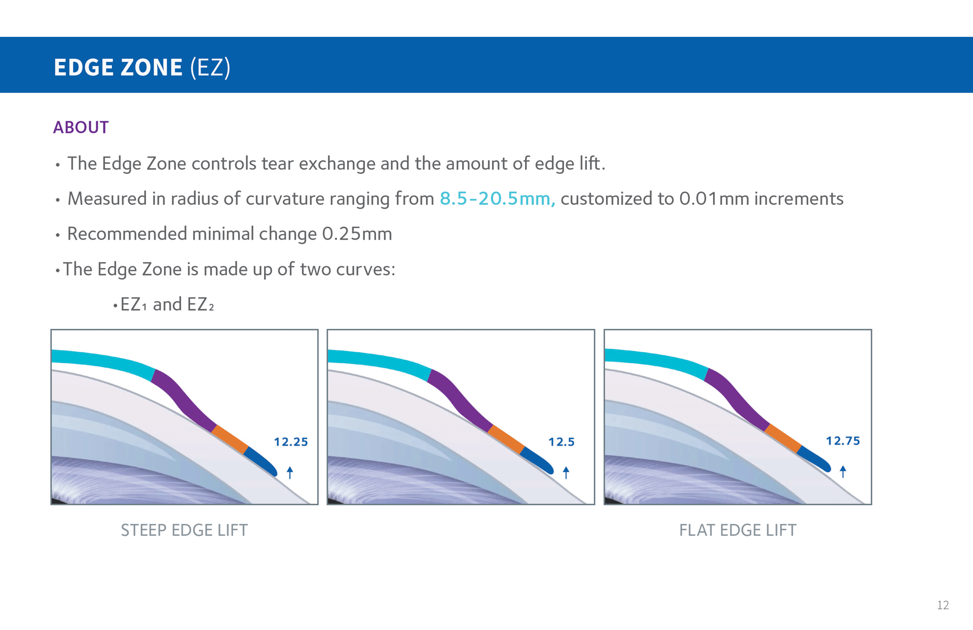
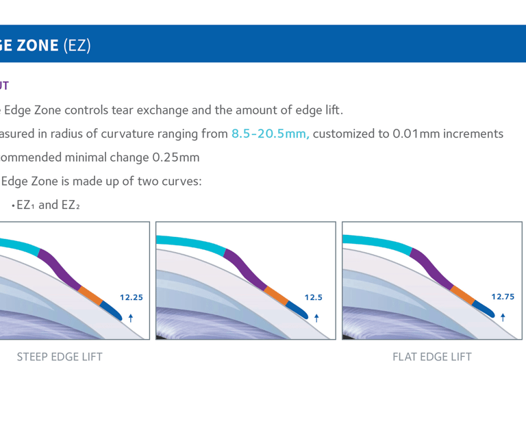
All Eye Care Practitioners (ECPs) who fit Ortho-K lenses must complete a certification process that requires clear, accurate, and well-structured learning materials. The existing training resources lacked visual consistency and precision, making it difficult for practitioners to master the complex fitting steps for Paragon CRT® and iSee™ lenses.
APPROACH
Developed two comprehensive certification programs designed to teach the complete Ortho-K fitting process—from lens selection and application to evaluation and troubleshooting. Created detailed, technically accurate graphics and structured layouts to guide practitioners through each stage with clarity. Ensured each module met CooperVision’s educational and brand standards while maintaining visual distinction between the two product lines.

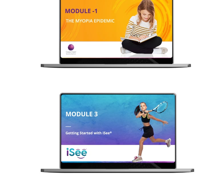
Role: Lead Graphic Designer
Team: Professional Affairs, Regulatory
Deliverables: Certification modules, lens fitting guides, troubleshooting graphics, ECP education materials
Design Highlights
Created precise lens-to-eye graphics — 1mm could make a difference
Translated complex clinical data into clear, visual instructions
Maintained brand consistency and compliance for a regulated industry
Educational & training Materials | Medical Device | Fitting Certification Modules
Paragon Vision Sciences & iSee
ESSENTIAL TRAINING TOOL
Delivered detailed, high-accuracy visuals that improved practitioner comprehension.
Elevated the certification experience with cohesive, brand-aligned materials.
TECHNICAL PRECISION
PROFESSIONAL CONSISTENCY
Impact
Required for all ECPs fitting Paragon CRT® and iSee™ Ortho-K lenses.
Design with Purpose.
SELSA Studio
Creative Design & Marketing
By Elsa Oroz
Get in touch
Connect
SELSAstudio@gmail.com
© 2025. All rights reserved.