
Innovative
Marketing Solutions


Paragon CRT®
Client: Paragon Vision Sciences
Role: Creative Direction & Execution. Developed concept and story, worked with vendors for production of reels and stand.
Collaboration: Marketing Director
Focus: Sales, B2C
Innovative Marketing Solutions | Interactive Tools


PROJECT OVERVIEW
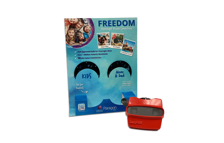
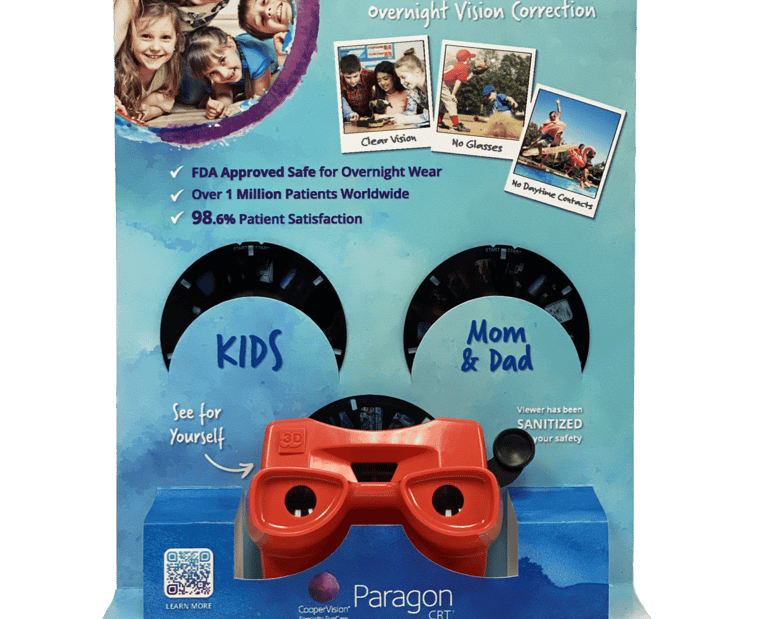
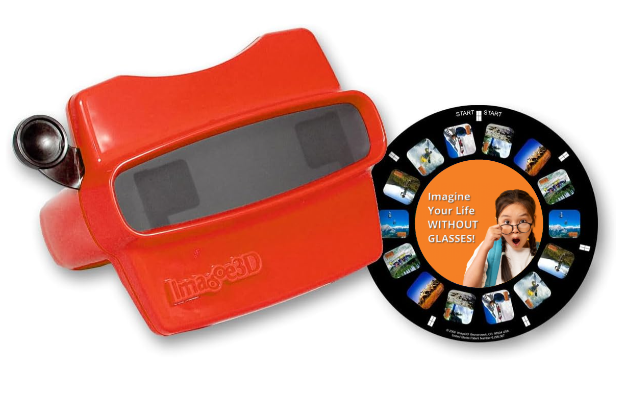
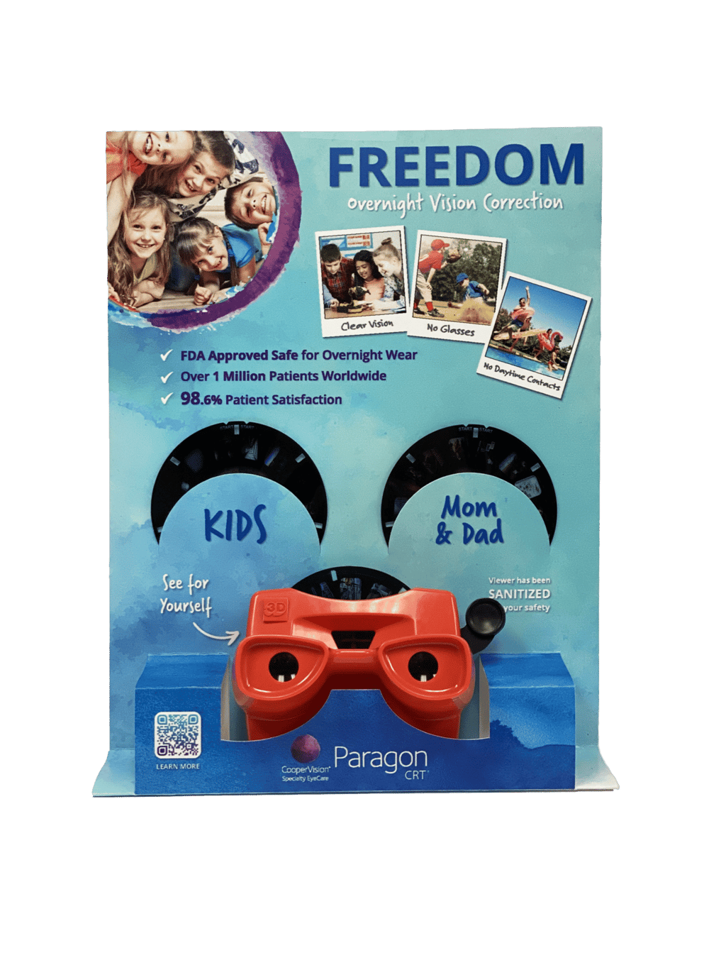
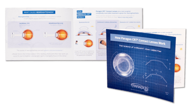
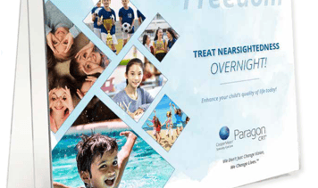
View-Master POP Display
To promote Paragon CRT® contact lenses in a way that resonated with both kids and parents, I led the development of a nostalgic-meets-novelty marketing tool: a custom-branded Viewmaster. This interactive piece brought the CRT journey to life in 3D and quickly became a standout favorite among the sales team and eye care practices. The project blended emotional appeal, education, and engagement into one cohesive experience.
Kids Story
Mom & Dad Story
Two Reels, One Story Series:
One Reel tailored for kids, highlighting the benefits in a fun, simple way.
One Reel for parents, briefly explaining what nearsightedness is, the challenges it can bring to children, and how the product can help.
Paragon CRT®
Innovative Marketing Solutions | Interactive Tools
PROJECT OVERVIEW
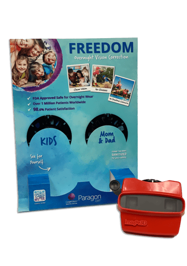
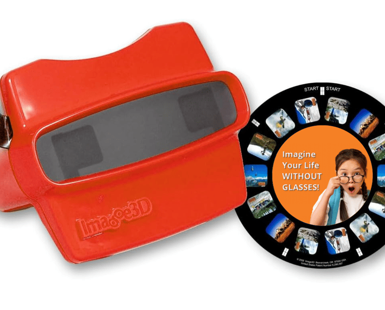
View-Master POP Display
To promote Paragon CRT® contact lenses in a way that resonated with both kids and parents, I led the development of a nostalgic-meets-novelty marketing tool: a custom-branded Viewmaster. This interactive piece brought the CRT journey to life in 3D and quickly became a standout favorite among the sales team and eye care practices. The project blended emotional appeal, education, and engagement into one cohesive experience.
Kids Story
Mom & Dad Story
Client: Paragon Vision Sciences
Role: Creative Direction & Execution. Developed concept and story, worked with vendors for production of reels and stand.
Collaboration: Marketing Director
Focus: Sales, B2C
Two Reels, One Story Series:
One Reel tailored for kids, highlighting the benefits in a fun, simple way.
One Reel for parents, briefly explaining what nearsightedness is, the challenges it can bring to children, and how the product can help.
PROJECT OVERVIEW
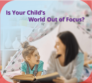
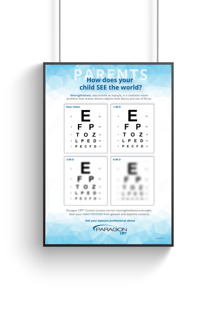
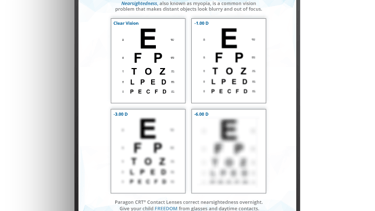
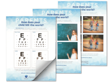
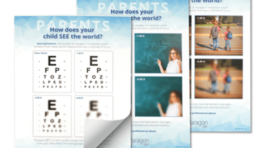
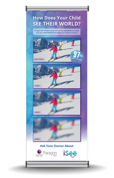
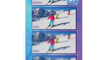
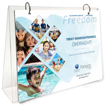
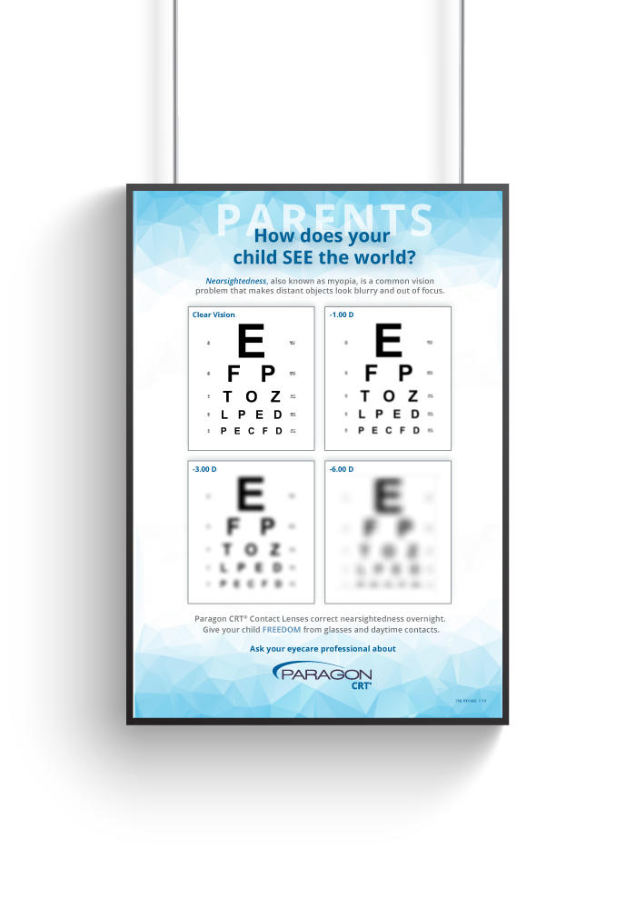
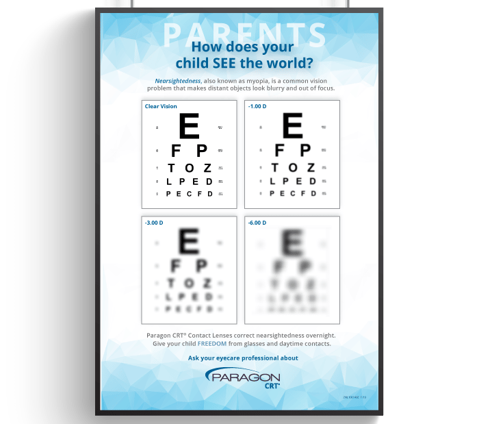
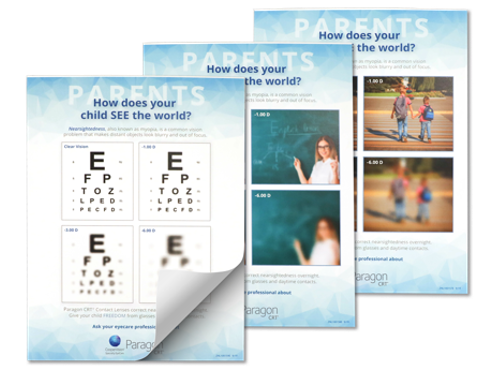
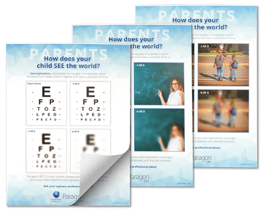
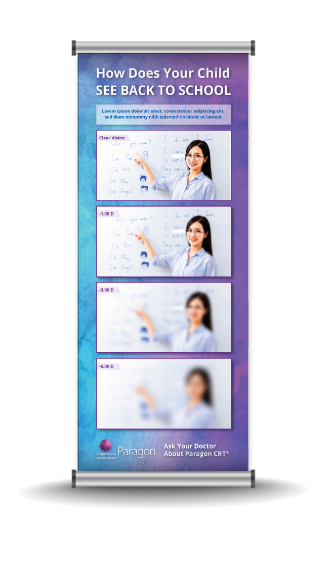
Levels of Nearsightedness
This innovative resource pack allows to parents to experience firsthand how their nearsighted children see their world. Critically relevant settings of the classroom, school crossing and more drive home the point of how myopia can impact a child’s welfare.
This initiative was created initially as a poster to be used in Eye Care Practitioners, then evolved into banners, and tear-offs for parents to take home and use as a reference.
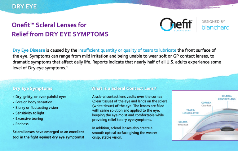
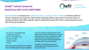
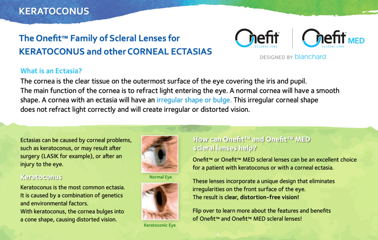
Onefit Scleral Lenses | Blanchard
Client: CooperVision
Role: Lead Designer
Collaboration: Marketing Director, Sales Reps
Stand-up Banner
Tear-off pads
In-office Posters
Innovative Marketing Solutions | Print Materials
“Sending an extra special shoutout to our incredibly talented designer
Elsa Oroz for going above and beyond to make this perfect.
While Picasso-esque perfection is simply in her nature, Elsa took this piece very seriously and personally, as she is a Onefit scleral lens wearer herself. She analyzed every aspect of the guide, comparing it to her daily application and removal experience. Elsa not only provided invaluable insights every step of the way, but also took the initiative to take high quality pictures of herself handling the lenses, filling in many gaps where our imagery was not ideal.
Thank you Elsa for your dedication in making this guide as detailed and user-friendly as it is beautiful.”
-Beth C.
Senior Manager, Marketing Communications
★★★★★
PROJECT OVERVIEW
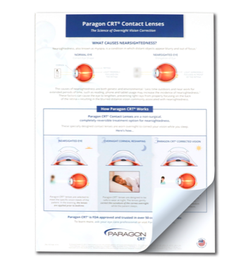
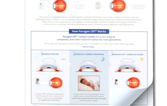
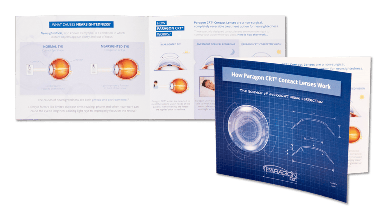
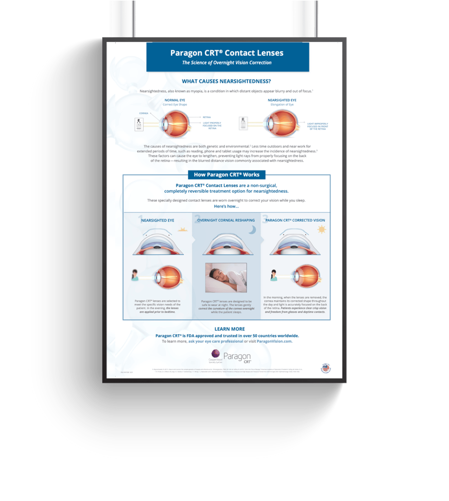
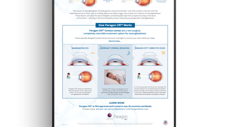
How Ortho-K Works?
The bay area of San Francisco is one of Ortho-K ( Orthokeratology) markets and is full of engineer parents who what to understand how Ortho-K works before they put their children into the treatment modality.
To answer that need for information, we created this piece that explains the physics and science behind the “magic” of Ortho-K.
+8,250
Reproductions for tear-off pads
Brochures Printed
5 Languages
+14,150
Translated into
Data from approximately 2022 (or earlier) indicates. Current figures are likely higher.
PROJECT OVERVIEW
Patient Consultation Guide
-
PROJECT OVERVIEW
Portfolio Brochure
The bay area of San Francisco is one of Ortho-K ( Orthokeratology) markets and is full of engineer parents who what to understand how Ortho-K works before they put their children into the treatment modality.
To answer that need for information, we created this piece that explains the physics and science behind the “magic” of Ortho-K.


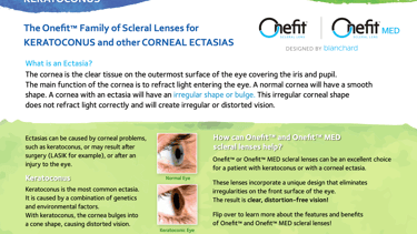
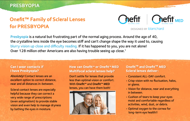
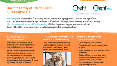
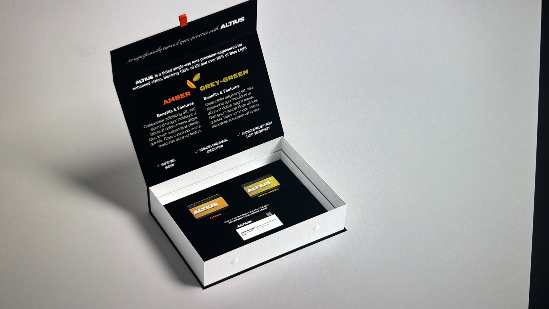
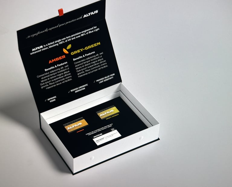
PROJECT OVERVIEW
Onefit™ Info Postcard
Partnered with the product marketer for Onefit™ scleral and irregular cornea business to create a postcard campaign that addresses a range of conditions including Dry Eye, Keratoconus, and Presbyopia.
The postcards are compact – while still large enough to tell our product story - and versatile enough to be displayed in a wide variety of ways.

PROJECT OVERVIEW
Levels of Nearsightedness
How does your child SEE the word?
42 Banners
Ordered
Reproductions for Tear-off Pads
+21,850
Data from approximately 2022 (or earlier). Current figures are likely higher.
43 Posters
Printed
Ortho-K Lens Fitting
Certification Modules
Designed two certification programs for Eye Care Practitioners (ECPs) to learn how to fit Paragon CRT® and iSee™ Ortho-K lenses. The project involved creating multiple technical guides — from getting started to troubleshooting — ensuring precise visual accuracy to support correct lens fitting.
Role: Lead Graphic Designer
Team: Professional Affairs, Regulatory
Deliverables: Certification modules, lens fitting guides, troubleshooting graphics, ECP education materials
ROLE & CONTRIBUTIONS
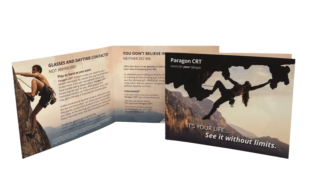
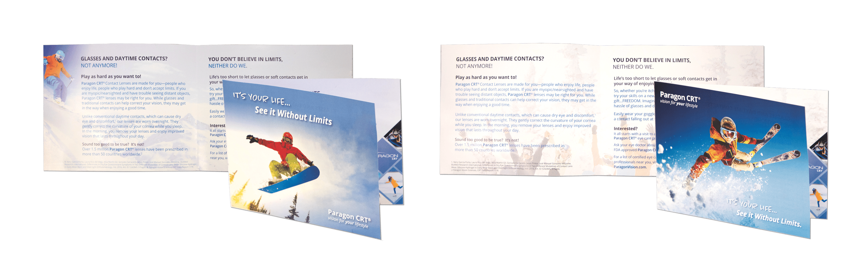
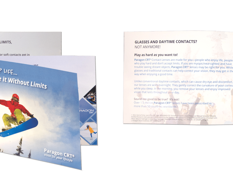
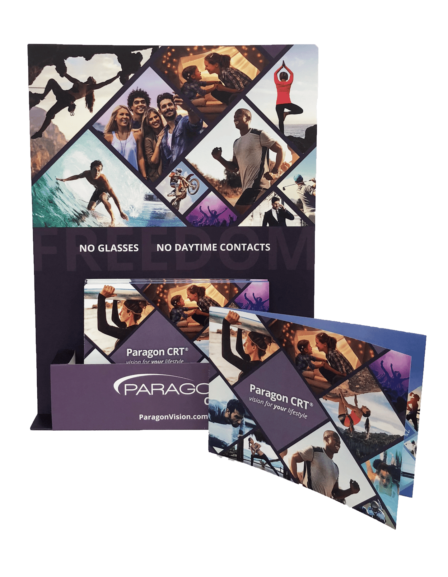
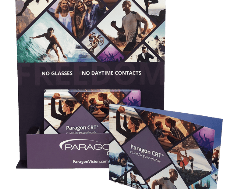
As the Lead Graphic Designer on this global campaign, I was responsible for bringing this campaign to life across every touchpoint:
Concept development for the full campaign look and feel
Visual storytelling across multiple lifestyle themes
Designing all key materials:
Full Visual Identity for the lifestyle campaign
Booth Graphics for two major trade show events
Printed Brochures (ordered in 10,400+ copies, translated into multiple languages)
Landing Pages and Digital Assets
Posters and Stand-up Banners for clinics and practitioner offices
Event Signage and promotional materials
Video Introduction
Aligning design direction with marketing and product strategy
Managing visual consistency across print and digital outputs
Collaborating cross-functionally with the marketing team and external vendors
TOOLKIT ADOPTED
+90% of regions
Write a short text about your service
Write a short text about your service
Service title 2
Service title 3
FINAL DESIGNS
Toolkit & System Overview
This was a passion project for me—one that merged my visual storytelling skills with my personal values around sustainability and planet care. I’m proud of how each element tells a story and how the toolkit empowers teams to communicate sustainability with purpose and impact.

DESIGN APPROACH & CREATIVE CONTRIBUTIO
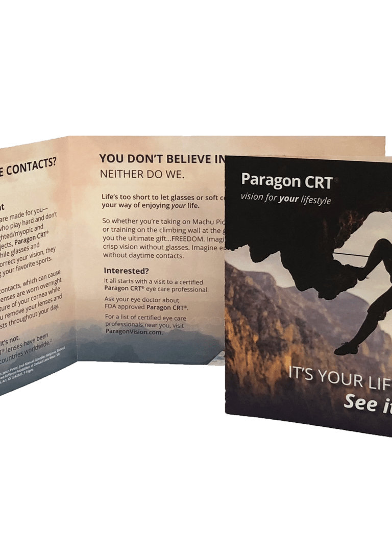
We created a modular visual system rooted in the four elements—Water, Fire, Earth, and Air—to represent diverse adult lifestyles:
Water: Surfer/water sports
Fire: Social lifestyle, bold and expressive
Earth: Rock climber, grounded and adventurous
Air: Business professional, urban, sleek
All Elements: A general creative merging lifestyles for broader appeal
This layered approach allowed us to target different personas, while keeping the overall campaign cohesive, fresh, and energetic. Bold imagery, movement, vibrant colors, and lifestyle photography were key components.
Design with Purpose.
SELSA Studio
Creative Design & Marketing
By Elsa Oroz
Get in touch
Connect
SELSAstudio@gmail.com
© 2025. All rights reserved.